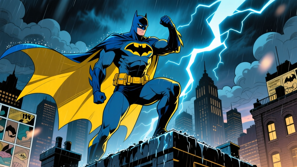
From a pulp detective's midnight-blue cape to a billion-dollar cinematic icon — the color story behind the Batsuit that never stops evolving.
🧛Batman — The Blue & Yellow Legacy
1. A Pulp Vigilante Is Born (1939)
The cover of Detective Comics #27, dated May 1939, shows a figure swinging on a rope through a Gotham night sky. His cape is midnight blue. His gloves, trunks, and the scalloped fins on his cowl are a vivid canary yellow. There is no bat emblem on his chest yet — just the stark contrast of dark blue against bright yellow, a color scheme that screamed "look at me" from a newsstand rack crowded with four-color heroes.
Bob Kane drew the cover. Bill Finger wrote the story. The character they created together was called "the Bat-Man," and the costume was not the product of some meticulous design workshop. Kane later admitted he lifted the winged silhouette from a sketch in one of Leonardo da Vinci's notebooks — specifically, da Vinci's ornithopter drawings, which featured bat-like membrane wings attached to a human frame. Finger's contributions were less visual and more tonal: he insisted the character wear gloves (so he wouldn't leave fingerprints at crime scenes), added the cowl's ear-like fins to sharpen the bat profile, and pushed for a darker overall palette that suggested a creature of the night rather than a circus strongman.
The blue-and-yellow scheme on that first cover was partly a printing constraint and partly a marketing calculation. In 1939, four-color process printing on cheap newsprint could render a limited range of hues reliably. Deep blues held their saturation better than most dark colors on the rotary presses of the era, and yellow was the highest-visibility accent a cover artist could choose. A figure in blue and yellow would read clearly even at thumbnail size — critical when your product is competing for a child's dime on a rack next to thirty other comics.
"I got the idea for the Bat-Man from Leonardo da Vinci's drawing of a weird flying machine. I drew a guy with a bat-like wing and put him in a domino mask. Bill Finger said, 'Make him look more like a bat.' So I put the ears on the cowl, and Bill suggested we use dark blue and yellow for the costume."
— Bob Kane, Batman and Me (Eclipse Books, 1989)
2. The Golden Age Palette
Through the early 1940s, the blue-and-yellow formula remained Batman's standard look, though the exact shades drifted from issue to issue — a common artifact of hand-separated color work in the Golden Age. In Detective Comics #33 (November 1939), the costume's blue read closer to a deep navy, almost indigo, while the yellow gloves and trunks leaned toward a warm gold. By Batman #1 (Spring 1940), the blue had lightened to a brighter royal and the yellow sharpened to something closer to lemon. Colorists at National Comics (DC's predecessor) did not work from a fixed color guide; each separation artist mixed inks independently, so the "same" costume could shift noticeably between pages, let alone between issues.
The bat emblem on the chest appeared in Detective Comics #29 (July 1939), just two issues after the debut. Initially it was a small, somewhat crude black bat silhouette placed on the left breast, barely larger than a lapel pin. By Batman #1, artist Jerry Robinson had refined the emblem into a broader, more stylized design that stretched across the full chest — a black bat shape with scalloped wing edges that would become the character's single most recognizable graphic element.
The Utility Belt Arrives
Also in Detective Comics #29, Batman acquired his signature utility belt — rendered in the same bright yellow as his gloves and trunks. The belt was Finger's idea, modeled on the tool belts worn by engineers and stagehands rather than military equipment. It contained vials of chemicals, a rope, and various detective implements. The yellow belt became a visual anchor point for the entire costume, breaking up the expanse of blue across the torso and giving artists a convenient horizontal line to frame action poses.
By the mid-1940s, as Batman stories shifted from pulp-horror tone toward lighter, more juvenile adventures (a response to wartime morale-boosting and the Comics Code's eventual arrival in 1954), the costume's colors brightened further. The blue became almost periwinkle in some printings, and the yellow took on a buttery warmth. This was the Batman who fought smiling gangsters and solved riddles in well-lit penthouses — a far cry from the shadowy figure who had strangled a man with a rope in Detective Comics #27.
3. Silver Age & the Grey Shift
The most consequential change to Batman's costume came in Detective Comics #327 (May 1964), when editor Julius Schwartz oversaw a wholesale redesign of the character as part of DC's broader "New Look" initiative. The change was both aesthetic and symbolic: the blue body of the suit was replaced with a light grey, while the yellow was retained for the gloves, trunks, and belt. A yellow oval was added behind the black bat emblem on the chest, making it pop against the lighter background.
The reasoning was commercial. Schwartz and artist Carmine Infantino wanted Batman to look cleaner, more modern, and more reproducible across licensed merchandise — a growing revenue stream after the character's profile had declined in the late 1950s. Grey photographed better for live-action references, reproduced more consistently in print, and gave the character a sleeker, more "scientific" appearance that matched the space-age optimism of the Kennedy era. The yellow oval emblem became Batman's primary logo and would remain so for over thirty years.
Then came the Adam West television series in 1966. The show used the grey-and-yellow costume exclusively — blue had been eliminated entirely from the live-action suit, which was a slate-grey bodysuit with a blue-grey cape. The show's campy, pop-art aesthetic cemented grey as the "default" Batman color for an entire generation of viewers who had never read a comic book. For the next two decades in the public consciousness, Batman was grey and yellow, not blue and yellow.
The grey suit was a product of its era — clean, bright, and designed to sell lunchboxes. The blue suit was a product of its origin — dark, strange, and designed to frighten criminals in alleyways.In the comics themselves, the grey-and-yellow scheme dominated through the late 1960s and most of the 1970s. Artists like Infantino, Gil Kane, and Irv Novick all worked in the grey palette, and the blue original seemed increasingly like a relic of a bygone era — something acknowledged only in reprints and retrospectives.
4. Neal Adams Restores the Night
In 1969, a young artist named Neal Adams began drawing Batman for DC, starting with a cover for Batman #200 and interior work on The Brave and the Bold. Adams had come from advertising and commercial illustration, and he brought a photorealistic draftsmanship that was unlike anything in mainstream superhero comics at the time. His figures had weight, his anatomy was precise, and his use of chiaroscuro lighting — deep, raking shadows that carved faces into angular planes — made every panel look like a still from a noir film.
Adams, working closely with writer Denny O'Neil, pushed Batman back toward his dark, pulp-detective roots. The stories they produced together — "The Joker's Five-Way Revenge" (Batman #251, 1973) and "Night of the Stalker" (Detective Comics #439, 1974) among them — were moody, atmospheric, and psychologically intense. And Adams made a specific choice about the costume: he began depicting the grey body as progressively darker, pushing it toward a steel blue-grey that, in many panels, was virtually indistinguishable from the original 1939 blue.
This was not an official editorial mandate. Adams simply painted and inked the suit darker because it suited the tone of the stories he was telling. Colorists followed his lead, and by the mid-1970s, Batman's "grey" suit was frequently rendered as a deep midnight blue that recalled the Golden Age original. The yellow gloves, trunks, and emblem oval remained, but the overall impression was darker, more nocturnal — closer to Kane and Finger's 1939 vision than anything published in the intervening twenty-five years.
The Defining Cover: Batman #232
Adams' cover for Batman #232 (June 1971) is widely regarded as one of the greatest single images in Batman's publication history. It shows Batman crouched on a rooftop, his cape billowing around him like a living shadow, the city skyline jagged behind him. The costume is rendered in a deep blue-black, the yellow accents glowing against the darkness. Ra's al Ghul, the villain introduced in this issue, stands in the foreground with the cool composure of a Bond antagonist. The cover announced that Batman was no longer the campy TV detective — he was something elemental, something frightening.
Adams' influence extended far beyond his own pencils. He trained a generation of artists who would carry the torch — artists like Marshall Rogers, whose work on Detective Comics #471–476 (1977–1978, written by Steve Englehart) pushed the dark, atmospheric approach even further. Rogers depicted Batman in a blue so deep it was nearly black, with the yellow accents serving as the only color relief on the page. The Rogers/Englehart run is frequently cited as one of the definitive Batman stories and a direct influence on the character's portrayal in Tim Burton's 1989 film.
5. Miller, the Movies & the Black Batsuit
The year 1986 changed Batman's costume — and arguably the character himself — more than any single year since 1939. Frank Miller published The Dark Knight Returns, a four-issue miniseries set in a dystopian near-future where an aging Bruce Wayne comes out of retirement. Miller drew Batman in a costume that was almost entirely black, with only the faintest suggestion of blue in the highlights and the yellow utility belt and emblem as the sole color accents. The suit was bulkier than previous interpretations, almost armor-like, and the bat emblem was simplified to a thick, brutal black shape that looked stamped onto kevlar.
Miller's visual language was deliberate. The black suit communicated that this Batman was not a superhero — he was a vigilante operating outside the law, in a world that had outlawed costumed crimefighters. The darkness of the suit reflected the darkness of the story: urban decay, government overreach, media sensationalism, and one man's refusal to stop fighting even when the world has moved on without him.
The impact on subsequent Batman portrayals was seismic. Tim Burton's Batman (1989) used an all-black suit with a yellow emblem, influenced directly by Miller's work and the Neal Adams dark-blue era. Michael Keaton's Batman was armored, rigid, and almost sculptural — the suit looked like it was carved from obsidian. The film's massive commercial success ($411 million worldwide on a $35 million budget) made the black Batsuit the default in popular culture for the next decade.
The 1990s: Armor, Gadgets, and Event Fatigue
In the comics, the 1990s saw the Batsuit evolve into something more technological and less cloth-like. The "Knightfall" storyline (1993–1994), in which Bane breaks Batman's back, introduced a mechanized suit of armor worn by the replacement Batman, Jean-Paul Valley (Azrael). This suit was garish by comparison — metallic gold and black with protruding gadgets — and was narratively designed to show how far the character had strayed from his roots. When Bruce Wayne reclaimed the cowl, he returned to a streamlined black-and-blue suit, signaling a course correction.
Jim Lee's artwork on Batman: Hush (2002–2003) presented perhaps the most polished version of the "modern" Batsuit: a deep midnight blue that bordered on black, with subtle grey highlights on the musculature, bright yellow utility belt and emblem oval, and an overall look that balanced tactical realism with classic superhero glamour. Lee's Batman became the template for animated series, video games, and merchandise throughout the 2000s.
Nolan's Tactical Black
Christopher Nolan's Batman Begins (2005) stripped the suit down to pure military-spec functionality. Christian Bale's Batsuit was black Nomex survival suit with segmented armor plating, a sculpted cowl, and a cape made of "memory cloth" that could rigidify into a glider wing. There was no blue, no yellow trunks, and no yellow gloves. The only yellow was the bat emblem on the chest, and even that was rendered in a muted, almost bronze tone. The suit was designed to be believable — something a real person with access to military hardware might actually build.
Zack Snyder continued this trajectory in Batman v Superman: Dawn of Justice (2016), giving Ben Affleck a bulky, fabric-and-armor hybrid suit that was grey-black in its standard configuration and featured a separate "mech suit" for the Superman fight. Matt Reeves' The Batman (2022) with Robert Pattinson went even further into tactical realism, presenting a suit assembled from surplus military gear and modified motorcycle armor, with combat boots and a chest emblem that appeared to be repurposed from a car part.
6. Rebirth & the Modern Blue Return
DC's "Rebirth" initiative in 2016 was explicitly positioned as a return to legacy and optimism after the grim, deconstructionist tone of the New 52 era (2011–2016). For Batman, this meant a return to the blue. Artist John Romita Jr. and writer Tom King launched the relaunched Batman series (Vol. 3, #1, August 2016) with a Batsuit that was unmistakably, deliberately blue — a deep, rich navy across the entire body with bright yellow accents on the belt, gloves, and bat emblem. The grey years were over, at least for the main continuity title.
Subsequent artists on the title — Mikel Janin, Clay Mann, Jorge Fornes, and especially James Tynion IV's collaborator Jorge Jimenez — each brought their own interpretation of the blue suit. Jimenez's version, which dominated from 2018 to 2022, featured a deep midnight blue with slightly purple-tinted highlights and a yellow emblem that sat inside a subtle oval shape — a deliberate callback to the Silver Age design, but rendered with modern inking and coloring techniques that gave it depth and texture Kane could never have achieved on a 1939 press.
The animated series Batman: Caped Crusader (2024, Amazon Prime) designed by Bruce Timm returned to a simplified Golden Age aesthetic, dressing Batman in a suit that was predominantly midnight blue with yellow gloves and belt — a deliberate visual quote from Detective Comics #27. The show's producers stated in interviews that they wanted to capture the "pulp detective" feel of the original concept, and the color scheme was a key part of that visual identity.
"The blue suit says something the black suit doesn't. Black says 'I am armored, I am tactical, I am prepared for war.' Blue says 'I am the night. I am the shadow. I am something you cannot explain.' Batman at his best is not a soldier. He is a ghost story."
— Tom King, interview with The Comics Journal (2018)
The pattern across 85 years is clear: the Batsuit oscillates between blue and black in response to the cultural moment. When Batman is positioned as a detective, a mystery figure, or a legacy character, he wears blue. When he is positioned as a warrior, a soldier, or a deconstructionist critique of vigilantism, he wears black. The yellow has remained remarkably constant — the utility belt, the emblem backing, and occasionally the gloves and trunks have carried yellow in every decade since 1939. It is the blue that wavers, retreats, and returns.
7. Collector's Guide to Key Issues
For collectors interested in the visual evolution of the Batsuit — specifically its blue-and-yellow chapters — a handful of issues stand as essential (and increasingly expensive) acquisitions. The values below reflect approximate market prices for CGC-graded copies in mid-grade condition (6.0–7.0 VF/Fine) as of early 2025, based on Heritage Auctions and GoCollect sales data.
| Issue | Date | Significance | Approx. Value |
|---|---|---|---|
| Detective Comics #27 | May 1939 | First appearance of Batman; original blue-and-yellow suit | $900,000–$1,500,000 |
| Detective Comics #29 | Jul 1939 | First bat emblem on chest; utility belt debut | $150,000–$280,000 |
| Batman #1 | Spring 1940 | First solo series; refined bat emblem; Joker & Catwoman debut | $200,000–$550,000 |
| Detective Comics #327 | May 1964 | "New Look" redesign; grey suit with yellow oval emblem | $800–$2,500 |
| Batman #232 | Jun 1971 | Neal Adams cover; Ra's al Ghul debut; dark blue rendering | $2,000–$5,500 |
| Detective Comics #474 | Dec 1977 | Marshall Rogers art; deep blue suit; Englehart/Run debut | $300–$900 |
| Batman: Year One #1 | Feb 1987 | Miller/Mazzucchelli origin retelling; dark blue-grey suit | $80–$250 |
| Batman #1 (Vol. 3) | Aug 2016 | Rebirth relaunch; deliberate return to blue suit | $8–$25 |
| Values are approximate and based on publicly reported auction results (Heritage Auctions, GoCollect, eBay sold listings) through early 2025. Actual prices vary significantly by condition, provenance, and market timing. | |||
The gap between Golden Age and Bronze Age values is striking. A mid-grade Detective Comics #27 costs more than a house in most American cities, while a mid-grade Batman #232 — arguably a more visually significant issue in terms of the suit's evolution — can be had for the price of a decent laptop. For collectors on a budget, the Marshall Rogers issues of Detective Comics (#471–476) offer the best value: deeply significant to the blue-suit lineage, beautifully drawn, and still available for under $1,000 in solid mid-grade condition.
Questions Readers Ask About the Blue Batsuit
Was Batman's original costume actually blue, or was it black?The cover of Detective Comics #27 clearly depicts the suit as dark blue with yellow accents. However, the interior pages — printed on cheaper stock with less precise color registration — sometimes render the dark areas as black. Bob Kane and Bill Finger consistently described the suit as blue in interviews, and official DC color guides from the era specify blue. The confusion arises from the printing limitations of 1939, where deep blues could easily read as black on the printed page.
Why did DC change the blue suit to grey in 1964?Editor Julius Schwartz wanted to modernize Batman and distance the character from the campy, science-fiction-heavy stories of the late 1950s. The grey suit was sleeker, reproduced more consistently in print, and photographed better for reference materials and merchandise. The change also coincided with the introduction of the yellow oval behind the bat emblem, which gave the chest logo a more defined, brandable look. The upcoming Adam West TV show (1966) further cemented grey as Batman's public-facing color.
Did Neal Adams officially change Batman's costume back to blue?No. There was never an official editorial decision to return Batman to blue. Adams simply drew and painted the grey suit in progressively darker tones that approached blue-black, and colorists followed his lead. The result was a de facto return to a dark blue palette that aligned with the darker, more mature stories Adams and Denny O'Neil were telling. It was an organic artistic choice, not a corporate directive.
What is the most valuable Batman comic featuring the blue-and-yellow suit?Detective Comics #27 (May 1939) is the undisputed king. A CGC 7.0 copy sold at Heritage Auctions in 2020 for $1.5 million, setting a record for the issue. Even low-grade copies (CGC 1.0–2.0) routinely sell for $150,000 to $300,000. For the blue-and-yellow costume specifically, this is the only issue that captures the original Kane/Finger design before any subsequent modifications.
Why do some Batman movies use black instead of blue?Filmmakers have consistently favored black for practical and tonal reasons. Michael Keaton's suit in Batman (1989) was black because Tim Burton wanted a darker, more Gothic aesthetic influenced by The Dark Knight Returns and Neal Adams' art. Christian Bale's suit in Batman Begins (2005) was black because Christopher Nolan aimed for tactical realism — a real-world military suit would not be dyed blue. Robert Pattinson's suit in The Batman (2022) was assembled from surplus military gear, which is naturally black, olive, or grey. Blue simply does not photograph as "dark" under low-light conditions, which is where most Batman scenes take place.
Will Batman ever return to the blue-and-yellow suit permanently?In the comics, the blue suit has been the default for the main Batman title since the Rebirth relaunch in 2016, and there is no indication that DC plans to change it. The character's publication history suggests a cyclical pattern: blue dominates for roughly 15–20 years, then a cultural shift (usually a blockbuster film) pushes the suit toward black for a decade or so, before comics course-correct back to blue. Given that the most recent major film (The Batman, 2022) used black, the comics will likely continue to fly the blue flag for the foreseeable future.