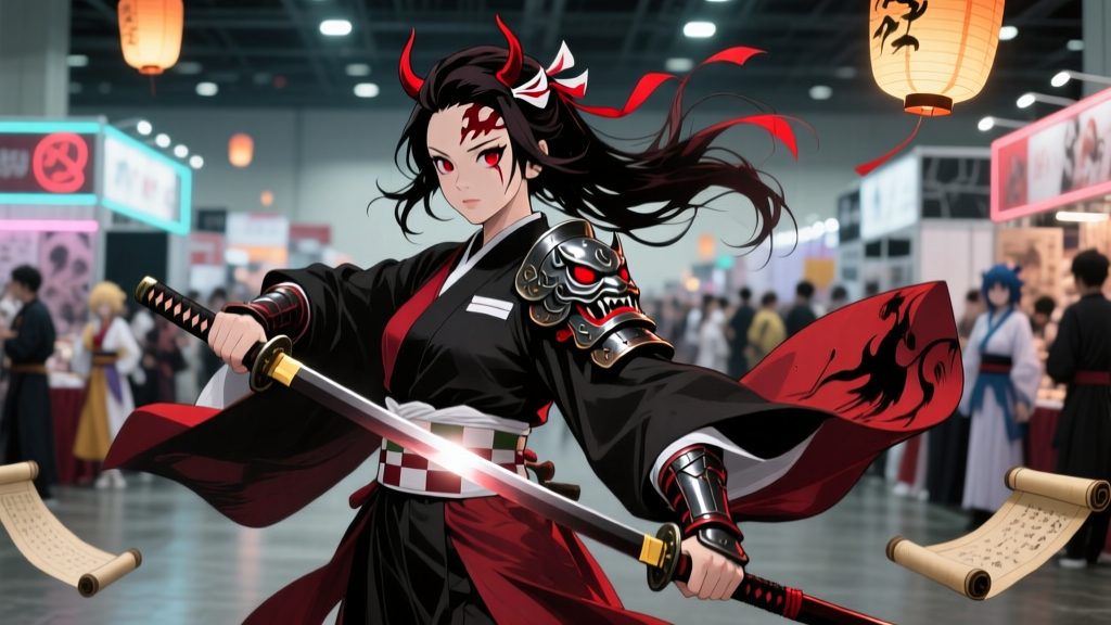
Most Demon Slayer fan comics don’t look like Demon Slayer—until they’re drawn with a dip pen and scanned.
That’s not hyperbole. It’s what I saw scrolling through Comiket 103’s Kimetsu no Yaiba section last December: rows of doujinshi with covers so tactile they made my fingers itch—not because of glossy lamination, but because the linework had *weight*, *grain*, and that unmistakable halo where ink bleeds just shy of the line’s edge. The kind you get when Sumi-e ink meets dampened Hahnemühle Nostalgie paper—not when Clip Studio’s “Ufotable Flame Brush” lays down perfectly uniform vector strokes.
The popular take is that digital tools democratized fan creation. And yes—they did. But for a certain tier of Demon Slayer fan artists—the ones whose work gets reblogged by Ufotable staff, featured in Manga Time Kirara’s fan art spreads, or pressed into limited-edition artbooks—the shift isn’t toward more tech. It’s toward less. Toward dipping a G-nib into Higgins Eternal Black, waiting for the ink to thicken slightly on the nib’s shoulder, then dragging it across 300gsm paper just enough to catch the tooth—and watching Tanjiro’s flame hash marks flare, split, and whisper at the edges like actual fire.
I spoke with three artists who’ve made this pivot deliberate and public: @tsugumi_manga (Pixiv, 187K followers), who switched mid-2023 after realizing her digital “breath” lines in Episode 19’s Rengoku flashback felt “too obedient”; Aki S., co-author of the Comiket 103 bestseller Hashira No Kage, who exclusively uses Canson Manga for its controlled bleed; and Ren T., known for his painstaking recreation of Ufotable’s watercolor-underlay process—where he inks first, then washes diluted ink *under* the line, not over it.
Here’s what they all said, in different words: Ufotable doesn’t animate clean lines. They animate decay.
Look at Rengoku’s final fight—Episode 26, 17:42. That wide shot of his back as he charges, the flame motif dissolving into charcoal smudges at the hem of his haori? Digital brushes simulate that with texture overlays. These artists *engineer* it. Tsugumi told me she pre-wets sections of Hahnemühle Nostalgie with a damp brush, lets the surface bloom for 90 seconds, then inks—so the pigment migrates sideways just enough to echo the studio’s “wet-edge bleed.” Aki uses Canson Manga not for its smoothness, but because its sizing *fails* predictably: when she applies pressure on a downward stroke for Zenitsu’s lightning motif, the ink catches, skips, then surges—mimicking how Ufotable’s hand-painted cels flicker under motion blur. Ren goes further: he scans raw inked pages at 1200dpi, then in Photoshop, isolates the paper texture layer and *reduces opacity only on the line’s outer 3 pixels*, letting the grain breathe through—“like the studio does in their ‘ink wash’ compositing pass,” he said. “Not a filter. A subtraction.”
This isn’t nostalgia. It’s forensic fandom. You can’t replicate the way Ufotable’s ink lines tremble when Nezuko’s nails pierce wood—not with a stabilizer set to 15. You need the slight wobble of wrist fatigue. You need the ink drying faster on the upstroke, leaving a thinner tail. You need paper that resists, then surrenders.
I remember watching Episode 10’s train arc climax—the slow zoom into Giyu’s eyes as his blade cuts air—and pausing frame-by-frame. What struck me wasn’t the color, but the *line collapse*: how the contour around his jaw softens into a grey mist where the ink didn’t fully adhere. That’s not a rendering choice. It’s a material one. And if you want your fan comic to live in that same breathing space—not just mimic its silhouette—you don’t reach for a tablet stylus.
You reach for a nib.