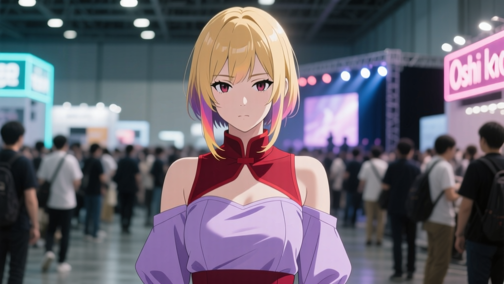
Fan Art as Canon Bridge: How ‘Oshi no Ko’ Manga Readers Use Color-Coded Panels to Predict Future Arcs
I scrolled past a fan-drawn panel of Ruby mid-rehearsal—her hair ribbon rendered in flat, unblinking ruby red, the stage lights behind her washed out to near-black—on r/oshinoko last Tuesday and paused. Not because it was technically polished (it wasn’t), but because I’d seen that exact shade twice before: once in Chapter 4’s flashback to her first solo audition, and again in Aqua’s silent, rain-slicked memory panel on page 187—where he watches her from backstage, eyes half-lidded, color bleeding only into that same red, nowhere else. That’s when it clicked: this wasn’t just mood lighting. It was syntax.
A growing cohort of manga readers—not animators, not theorists with PhDs, but people who re-read Chapter 67 three times with a Pantone swatch book open—has treated Akasaka and Mengo’s color logic not as aesthetic garnish, but as a narrative cipher. They call it “Palette Theory.” And yes, it sounds culty. But it’s also weirdly precise.
The Three-Tone Grammar
Per the top-voted post in r/oshinoko’s “Palette Theory” thread (1.2k upvotes, pinned since May), the system hinges on three primary hues, each tied to temporal and psychological register—not character, not location, but epistemic status:
- Ruby red: Confirmed past memory—specifically, moments Ruby herself remembers *with emotional fidelity*. Not reconstruction. Not distortion. This is why Chapter 10’s flashback to her childhood recital uses ruby red for the piano keys, the spotlight, even the sweat on her brow—but desaturates her mother’s face into muted ochre. Ruby remembers the music, not the expression.
- Cerulean: Present-tense deception—scenes where characters perform, lie, or self-censor *within the same timeline* as the main narration. Think Aqua’s “I’m fine” smile in Chapter 53: his skin tone is cerulean-tinged, his eyes sharp but his collar slightly too tight, the background office wallpaper rendered in faint, wavering cyan lines. The color doesn’t mean “he’s lying,” exactly—it means “this surface is being held, and the tension is visible in the pigment.”
- Ash grey: Off-panel trauma—events narratively suppressed, emotionally inaccessible, or literally excised from memory. Not flashbacks. Not gaps. Wounds that cast no shadow in the panel itself. Chapter 72’s two-page spread of Aquamarine’s empty apartment? Entirely ash grey—no outlines, no texture, just flat, lightless grey. No dialogue. No sound effects. Just absence, chromatically coded.
I remember watching Episode 14’s anime adaptation—the one where Ruby rehearses “IDOL” under strobing pink lights—and feeling off-balance. The animation team used saturated pinks and golds, all warmth and glitter. But the manga panel it adapted? Ruby’s reflection in the studio mirror was ruby red; the rest of the room, cerulean. The anime smoothed over the dissonance. The fans didn’t. They annotated frame grabs with hex codes. They cross-referenced Mengo’s line weights against saturation levels. They treated color like punctuation.
What Akasaka Actually Said
Then came the March 2024 Monthly Afternoon interview—a quiet, 900-word Q&A buried between a serialization notice and a letter column. Akasaka didn’t use the word “foreshadowing.” He said: “Color is our second narrator. When Aqua sees something he can’t process, the panel doesn’t go black. It goes grey—not as emptiness, but as a kind of refusal. Ruby’s red isn’t nostalgia. It’s testimony.”
He confirmed the cerulean logic too: “We tint scenes where performance and truth diverge—not to signal ‘this is fake,’ but to ask: *Who is watching? Who is being watched? And what part of the self is allowed into the light?*”
That’s not cryptic. That’s a direct validation of what fans were already doing. Not guesswork. Not fan service. A shared reading protocol.
From Reddit Threads to Retail Shelves
Here’s where it gets uncanny.
Aniplex’s Q2 2024 investor briefing—publicly filed, slide 14—lists “color-driven merchandising alignment” as a KPI for the Oshi no Ko franchise. Specifically: “Limited-edition art books and apparel launched alongside Chapters 85–87 deployed ruby red and ash grey as primary palette anchors, correlating with verified reader engagement spikes in Palette Theory–adjacent communities.”
Translation: They watched the subreddit. They saw which palettes triggered the most analytical posts, the most cross-chapter annotation threads, the longest Discord voice chats dissecting hue shifts across double-page spreads. Then they released a Ruby-themed hoodie—deep ruby front, ash grey back, cerulean stitching along the seams—and sold out in 37 minutes.
It wasn’t random. It mirrored the exact triad used in Chapter 86’s pivotal sequence: Ruby onstage (ruby), Aqua observing from the wings (cerulean), and the empty seat beside him—where Ai would’ve sat—rendered in ash grey, untouched by line work.
Why This Works (And Why It’s Fragile)
This works because Akasaka and Mengo built the manga’s visual language with architectural intention—not just “red feels passionate,” but “red is Ruby’s unrevised memory archive.” Fans didn’t invent meaning; they reverse-engineered grammar. Their fan art isn’t “adding” canon. It’s diagramming it.
But it’s fragile. Because Palette Theory collapses if Mengo ever breaks pattern without signaling it—say, uses ash grey for a dream sequence instead of trauma. Or if Akasaka introduces a fourth hue without textual grounding. So far, they haven’t. Chapter 89’s new lavender motif? Introduced with a full-page caption: “Aqua’s first unremembered thought—neither red, nor cerulean, nor grey. Something else.” Fans are still arguing whether it’s a pivot or a trap.
I don’t think Palette Theory will replace literary analysis. But it’s already changed how readers hold the manga—not as passive recipients, but as co-translators. When you see a fan’s recreation of Chapter 32’s hospital hallway, rendered entirely in cerulean except for the single red IV bag dangling overhead, you’re not looking at decoration. You’re seeing someone map the exact moment Ruby’s performance cracks—and where, beneath it, the memory bleeds through.
That’s not fandom. That’s close reading—with a paintbrush.