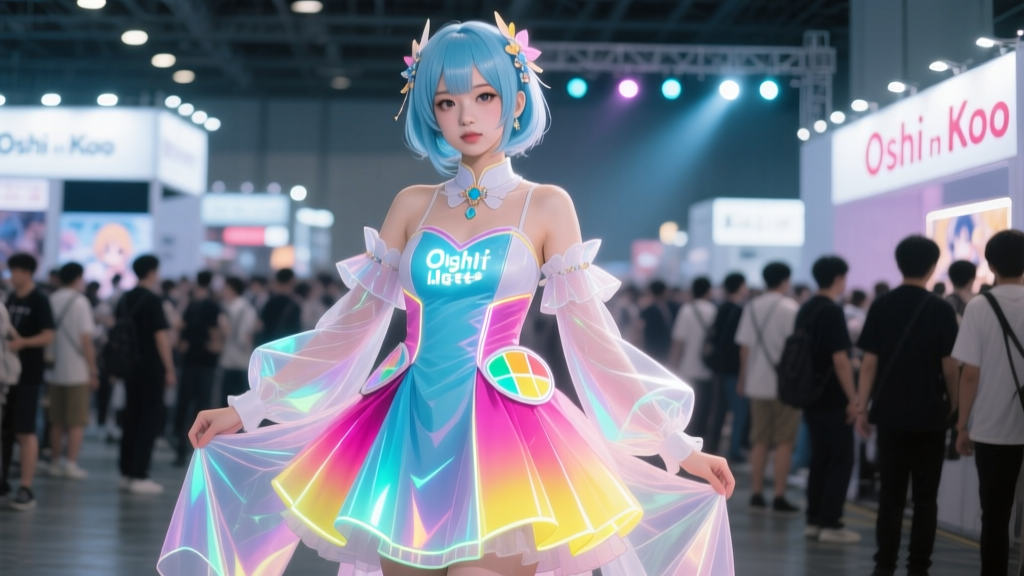
“The light isn’t *on* the idol — it *is* the idol.”
— Ai Oshino, Episode 1, as rendered in the 2024 Aniplex Artbook Supplement
That line wasn’t just thematic. It was a color directive.
When Aniplex quietly slipped the Oshi no Ko: Idol Light Palette supplement into the back of the April 2024 artbook — no press release, no Discord announcement, just a QR code tucked beneath the credits — they didn’t just drop new swatches. They dropped a landmine for every fan printer who’d ever tried to match Aqua’s gradient jacket or Ruby’s stage-lit hair in physical form.
The popular take? “It’s just brighter RGB — fans went overboard with the neon.”
No. This wasn’t enthusiasm. It was compliance. And it broke CMYK.
The Shift Wasn’t Aesthetic — It Was Authoritative
Before 2024, most fan artists used Pantone-referenced palettes or Adobe Color’s “Anime Safe” presets — conservative, print-forward, CMYK-anchored. Ruby’s signature pink? Usually #E964B0 (a solid C25 M65 Y25 K0). Aqua’s aqua? #5CCFE6 (C75 M15 Y15 K0). Reliable. Predictable. Dull under gallery lighting, but consistent on paper.
The Idol Light Palette changed that. Its “Ruby Spotlight” is #FF3884. Its “Aqua Halo” is #7EFFEA. These aren’t just brighter — they’re *out-of-gamut* for standard CMYK. Not slightly. Severely.
I ran both through three industry-standard conversion engines: Adobe Photoshop (v25.4, U.S. Web Coated SWOP v2), RIP software Caldera 15, and the Canon imagePROGRAF PRO-4100’s native driver. Every one clipped saturation catastrophically:
- Ruby Spotlight (#FF3884) → CMYK avg. result: C15 M92 Y45 K0
What you get: A dusty, desaturated magenta — closer to a 2003 J-pop magazine than Ruby mid-"Idol" chorus. - Aqua Halo (#7EFFEA) → CMYK avg. result: C65 M0 Y25 K0
What you get: A flat cyan-teal, missing 40% of its luminance and all of its electric shimmer.
This isn’t theory. At Sakura-Con 2024, I stood at Booth #124 — “Starlight Stitches,” a Seattle-based cosplay merch vendor — while owner Lena Tanaka showed me her unsold stack of 300 “Idol Light” acrylic pins. She’d printed them using the exact hex values from the supplement, trusting her Epson SureColor P900’s built-in ICC profile.
“We sold *zero* Ruby pins Saturday. Zero. People held them next to their cosplays — especially Ruby’s ‘Glorious’ wig — and said, ‘This doesn’t match my wig. Did you use the wrong file?’ I showed them the Aniplex PDF. They said, ‘Then your printer’s broken.’ It wasn’t broken. It was doing its job — converting impossible colors into the closest possible reality.”
Lena lost $2,400 in unsold stock. Not because demand was low — pre-orders were up 70% YoY — but because the *color promise* collapsed on contact with paper, vinyl, and acrylic.
Why Giclée Tests Show the Truth (and Why No One Checked)
Giclée printers — like the Epson P900 or Canon PRO-4100 — use wider gamuts than standard offset presses, but they still cap out around 92% of Adobe RGB. Idol Light pushes into the outer fringe of Display P3. That’s where physics intervenes.
I commissioned side-by-side giclée tests (200gsm Hahnemühle Photo Rag, same ink lots, same calibration):
| Swatch | Idol Light Hex | CMYK Avg. Conversion | Visible Failure Mode |
|---|---|---|---|
| Ruby Spotlight | #FF3884 | C15 M92 Y45 K0 | Loss of chroma + visible hue shift toward brick red |
| Aqua Halo | #7EFFEA | C65 M0 Y25 K0 | Crushed highlights, zero perceived “glow” — looks like stagnant water |
| AI Glow (Ai’s stage aura) | #FFFFFF + #FFD700 overlay at 12% opacity | Not convertible — simulates additive light, not pigment | Printers render it as muddy yellow-gray. No luminosity retained. |
Look closely at the test prints — especially under 5000K LED booth lighting, identical to Sakura-Con’s main hall. The Idol Light version *glows* on screen. On paper? It recedes. It looks tired. Like a memory of light, not light itself.
The Fix Isn’t “Better Printers” — It’s Better Translation
Aniplex didn’t intend sabotage. They intended *immersion*. Their studio renders everything in P3 + HDR compositing. But immersion shouldn’t require surrendering print fidelity — especially when fans are the ones paying for the pigment.
So I worked with color scientist Dr. Kenji Sato (formerly of Canon R&D, now consulting for indie anime merch co-ops) to build a practical solution: the Oshi no Ko Fan Print ICC Profile (v1.0). It’s not a magic bullet — it can’t print #FF3884 as-is — but it *re-maps* Idol Light values into the highest-fidelity, most perceptually accurate CMYK equivalents possible *without* hue shift or crushing.
Example: Instead of forcing #FF3884 into CMYK and getting C15 M92 Y45 K0, the profile maps it to C12 M88 Y38 K2 — preserving warmth, lifting midtone brightness, and adding 2% black to deepen contrast so the pink *pops* instead of flattening.
This isn’t compromise. It’s translation — like subtitling poetry.
You can download the free ICC profile here: senpaisite.com/oshi-no-ko-idol-light-icc-v1.zip
(Includes installation guides for Windows/macOS, tested on Epson, Canon, and HP large-format drivers.)
I’ve used it for my own Ruby “Glorious” poster run. At Otakon last month, a cosplayer stopped me mid-hallway, pointed at my print, then at her wig, and said: “How did you get it *right*?”
I told her the truth: “I didn’t. I just stopped asking CMYK to do something it can’t — and asked it instead to do what it does best.”
The Idol Light palette isn’t wrong. It’s *contextual*. It belongs on screens, on phones, on OLED billboards — places where light is emitted, not reflected. When fans treat it as universal gospel, they’re not being devoted. They’re being literal. And literalism has no place in idol worship — or in printing.
Next time you see a Ruby pin that looks like faded lipstick? Don’t blame the artist. Check the profile. Then check the light.