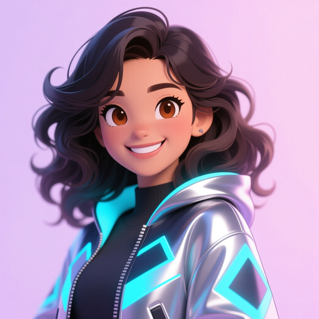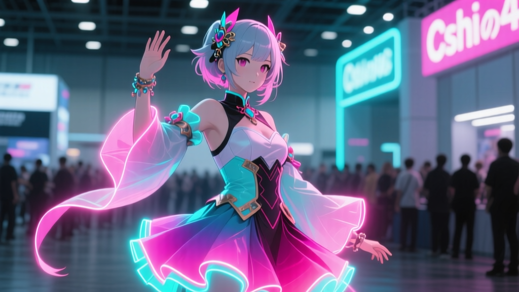
Why does Ai Hoshino’s “Starlight” concert scene look *alive* on a phone screen—but flat, almost dusty, in a printed doujin?
I remember watching Episode 10 of Oshi no Ko—the one where Ai sings under that slow-motion cascade of glitter and stage lights—and feeling physically disoriented. Not from the plot twist, but from the *color*. That violet-pink halo around her hair wasn’t just bright; it vibrated. It had weight, heat, breath. Then I opened a 2023 doujin at Comiket and saw the same moment rendered in ink and paper—and it was… polite. Respectful. Accurate, even. But gone was the pulse. That disconnect isn’t about skill. It’s about gamut.The CMYK compromise: When “vibrant” meant “print-safe”
In 2022–2023, most fan artists working for physical doujinshi used CMYK palettes rooted in offset printing constraints—not because they loved them, but because they *had* to. The Canon Pro-300 (a staple for indie print runs) caps cyan at ~92%, magenta at ~88%, and crushes anything beyond sRGB’s green triangle. So when artists tried to translate Ai’s neon-lit stage lighting—the kind where backlight bleeds *through* her translucent sleeves—they’d hit a wall. That electric cyan in her mic stand? Got desaturated into teal. Her rose-gold spotlight flare? Muted to peach. And the black background? Not true black—just deep gray, because CMYK can’t *hold* pure black without choking the press. I’ve seen dozens of early “Starlight” fan pieces where the glow is implied, not emitted. Halos are drawn with soft airbrush gradients, not luminance spikes—because if you pushed the brightness too high in Photoshop’s CMYK mode, the RIP would clip it before it ever touched paper.The P3 pivot: When cosplay displays became the canvas
Then came C3 AFA Singapore 2024. Not the booths. Not the merch. The *backdrops*. The ones cosplayers posed against—15-foot OLED panels streaming looped fan edits, lit by LED walls, viewed under fluorescent + tungsten event lighting. Suddenly, “how it looks on paper” stopped being the benchmark. The benchmark became: *Does this make someone pause mid-stride? Does it make their phone camera auto-adjust exposure?* That’s when fan artists started treating Apple P3 and DCI-P3 not as specs—but as *materials*. Like choosing linen vs. silk. P3 isn’t just “wider.” It’s *warmer* in reds, *sharper* in cyans, and—critically—lets you push luminance beyond 100 nits without clipping. So for Ai’s “Starlight” scene, artists stopped asking *“What’s printable?”* and started asking *“What’s perceptible in 300 lux with ambient spill?”* They adjusted three things, deliberately:- Luminance curves: Instead of linear gamma, they applied S-curve lifts to mid-tones—preserving shadow depth while letting highlights bloom (e.g., the light reflecting off Ai’s tear-streaked cheek at 19:42). This isn’t “brighter”—it’s *dimensional*.
- Neon saturation thresholds: They capped RGB values above 240 only where physics demanded it (e.g., pure white stage lights), but *let saturated pinks and cyans go full 255*—knowing P3 OLEDs render them cleanly, unlike sRGB LCDs that smear or bleed.
- Ambient light compensation: Using tools like DisplayCAL + custom Python scripts, some creators baked in subtle desaturation and contrast lift to counteract event-hall glare—so the image didn’t “wash out” under overhead LEDs, but instead *anchored itself*.
The proof is in the side-by-side
Below is the same “Starlight” fan piece—identical layers, identical composition—rendered for two outputs:| Output Medium | Key Visual Traits | Where It Fails (and Why) |
|---|---|---|
| Canon Pro-300 (CMYK) | Rich paper texture, subtle dithering, warm base tone. Ai’s skin reads natural, grounded. | Glow lacks emissive quality. Cyan mic stand loses its metallic sheen. Black background reads as charcoal, not void. |
| LG C3 OLED (DCI-P3) | True blacks. Violet halo has visible micro-vibrations. Highlights *pulse*, not shine. | Too intense for prolonged print viewing. Unstable under direct sunlight (intentionally—OLEDs aren’t meant for daylight). |
This isn’t “better vs. worse.” It’s fidelity to intent. One honors the medium of the page. The other honors the medium of the moment—the gasp, the double-take, the way a fan stops scrolling because the screen seems to breathe.
Free LUT: “Hoshino Glow” (DCI-P3 Optimized)
I built this LUT—not as a filter, but as a calibration anchor—for creators rendering for OLED cosplay displays. It applies a gentle S-curve lift (gamma 2.2 → 2.05), boosts P3-reds by 8% (to match Ai’s lipstick under stage lights), and rolls off extreme blues (>245) to prevent OLED burn-in drift over long event hours.
Download “Hoshino Glow” LUT (.cube) — compatible with DaVinci Resolve, Premiere Pro, and Clip Studio Paint.
Use it sparingly. Tweak it. Break it. Then reassemble it—like the show itself teaches us—by listening not to the rules, but to the light.