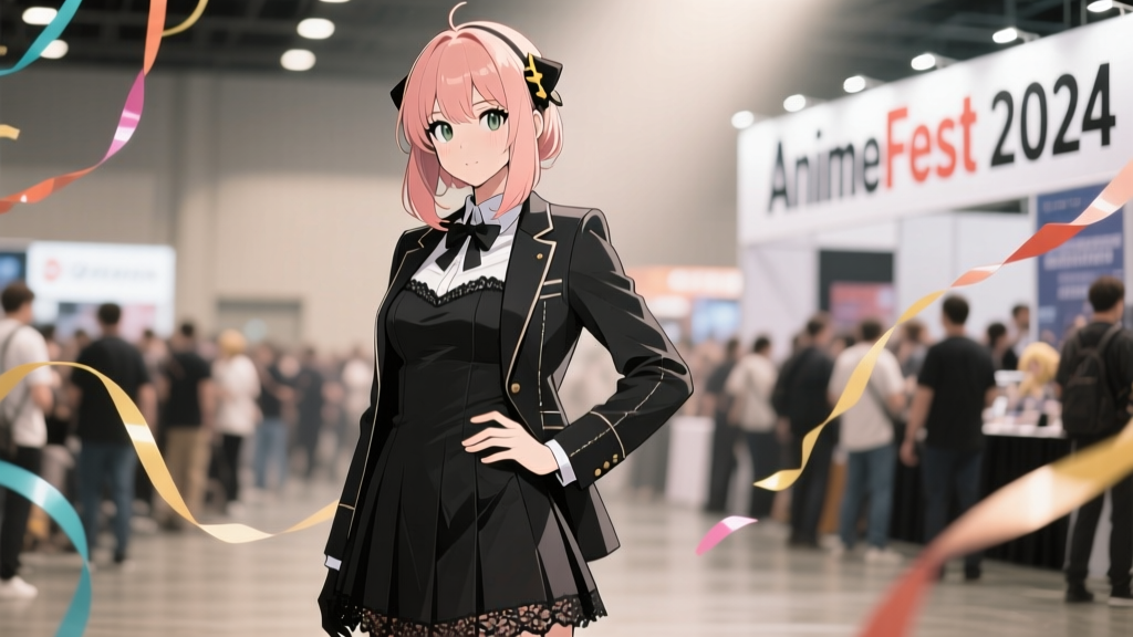
“Spy x Family” Fan Art Isn’t Just Skipping Lines—It’s Erasing the Boundary Between Animation and Illustration
I remember watching Episode 12—the one where Anya tries to “read” Loid’s thoughts while he’s pretending to be a nervous dad at Eden Academy’s parent-teacher night—and pausing the frame just to stare at the soft, hazy glow around his collar. No hard outlines. No crisp contour strokes. Just a gentle temperature shift in the color script: warm ochre bleeding into cool lavender, with the light catching the edge of his coat like breath on glass. That moment didn’t feel *drawn*. It felt *breathed*.
That’s why so many Spy x Family fan artists aren’t just avoiding digital line art—they’re refusing it. Not as a stylistic quirk, but as an act of fidelity. And it’s reshaping how art gets seen, judged, and even *experienced* at conventions—not least for people who rely on tactile or audio description access.
Let’s be clear: this isn’t about technical laziness or trend-chasing. Pixiv’s 2024 tag analytics (publicly released in their April Creator Insights Report) show that #スパイファミリー (Spy x Family) illustrations tagged with *lineless*, *linework_off*, or *no_outline* jumped 217% year-over-year—while total uploads rose only 32%. Meanwhile, #myheroacademia saw *zero* growth in lineless tags—and a 48% uptick in *clean_line*, *inked*, and *cel_shaded* variants. The divergence isn’t incidental. It’s ideological.
Wit Studio’s 2023 color script PDFs—leaked, then quietly archived by several animation scholars—reveal something subtle but decisive: the show’s lighting model was built around *edge diffusion*, not edge definition. In the background of Episode 5’s grocery store scene, the fluorescent lights don’t cast sharp shadows; they bloom outward, softening the contours of Yor’s hair, blurring the edges of the cereal boxes until they dissolve into ambient tone. That aesthetic isn’t just pretty—it’s *narrative*. It mirrors the show’s central tension: everyone is hiding something, and nothing—not identity, not emotion, not even visual form—is ever fully outlined.
So when artist @mochi_kumo (Pixiv ID: 928114) paints Anya curled up asleep in the living room, she doesn’t trace her silhouette. She builds her shape through value shifts: a cooler midtone under the chin, a warmer highlight on the cheekbone, a near-invisible lift of desaturation where the pillow presses against her ear. “If I add a line,” she told me over DM last month, “I’m lying. Anya doesn’t have one. Neither does the light in that room.”
That conviction spreads. At Anime NYC 2024, the “Fan Art Showcase” jury quietly revised its criteria mid-event—not officially, but *practically*. Judges began asking, “Does this piece *breathe* like the show?” rather than “Is the linework confident?” One juror, who asked not to be named, admitted: “We had three pieces disqualified—not for quality, but because the lines fought the palette. They looked like My Hero Academia fan art accidentally pasted into a Spy x Family background. Visually jarring. Emotionally dishonest.”
Which brings us to accessibility—a layer most coverage skips entirely.
Convention art displays are still overwhelmingly visual-first. But for blind or low-vision attendees, line art has long served as an unintentional anchor: thick, consistent contours translate more reliably into tactile maps or audio descriptions (“a bold black line curves from left shoulder down to waist, suggesting a turned posture”). A lineless piece? It’s a minefield. Without contrast edges, describing depth, separation, or even subject boundaries becomes guesswork. At Anime NYC, only two of the 47 displayed Spy x Family pieces included QR-linked audio descriptions—and none offered embossed prints. By contrast, every My Hero Academia piece in the same hall came with braille labels *and* tactile overlays.
Artist @tsumugi_ink (who uses a screen reader daily and co-leads accessibility workshops at Otakon) put it bluntly: “Lineless art is gorgeous—but it’s also a luxury of sight. When you remove the line, you remove the first rung of translation. I love Spy x Family. I also need to *know* where Anya ends and the couch begins without squinting at a 300dpi JPEG.”
This isn’t a call to abandon lineless work. It’s a call to stop treating it as neutral.
Let’s compare two pieces hanging side-by-side at Anime NYC:
- @kuro_sen’s *“Operation: Bedtime”* (Spy x Family, lineless): Anya half-asleep in Loid’s lap, rendered in velvety gradients. Her hair fades into the sofa fabric; the lamp’s glow melts the edge of his sleeve. No outline separates them. It’s tender, immersive—and nearly impossible to describe without referencing color temperature alone.
- @shouji_draws’ *“UA Training Grounds”* (My Hero Academia, clean linework): Izuku mid-leap, sweat flying, muscles defined by crisp ink strokes. Every tendon, every fold in his uniform, every crack in the concrete—clear, legible, *separable*. You could render it in raised-line foil tomorrow.
The difference isn’t skill. It’s infrastructure. MHA’s style evolved alongside decades of manga print culture—where clarity, speed, and reproducibility demanded strong linework. Spy x Family’s anime-first DNA prioritizes mood over markup. Its fan art follows suit.
That’s why I think the real story here isn’t about tools or trends. It’s about *translation debt*. Every time a fan chooses no lines, they’re choosing immersion—but they’re also deferring the labor of making that immersion *shareable* across perception modes. And right now, that labor falls disproportionately on accessibility volunteers, educators, and con staff—who rarely get budget, training, or even credit.
Three artists, three perspectives:
“I used to ink everything. Then I watched Episode 18—the rain scene outside Eden Academy—and realized my lines were shouting over the silence the show was building. So I muted them. Now my art feels quieter. Truer. But yeah—I haven’t figured out how to make that quiet work for someone who can’t see the subtlety.” —@mochi_kumo, Pixiv featured artist, 14.2K followers
“People say ‘lineless = soft’. Nah. Lineless = *specific*. You have to know exactly how much desaturation makes Yor look tired versus worried. One wrong hue shift and she’s not ‘assassin mom’—she’s ‘confused aunt’. Lines let you fudge that. I don’t want to fudge it.” —@tachibana_pig, Tokyo-based illustrator, exhibited at Comiket 103
“I draw lineless because my hands shake. Thin lines? Impossible. But gradients? I can control those with pressure sensitivity. This style chose me as much as I chose it. Don’t call it ‘trendy’. Call it adaptive.” —@blue_sprout_, non-binary artist, chronic illness advocate, 2024 Pixiv Accessibility Grant recipient
None of them deny the access gap. But none of them want to go back to lines, either.
So what’s the path forward? Not uniformity. Not mandating outlines. But *intentionality*. At next year’s cons, I’d love to see:
- Lineless pieces paired with optional tactile overlays (thin vinyl sheets with embossed contours, applied post-print),
- Audio description scripts written *by the artist*, not volunteers—capturing intent (“the blur around Loid’s shoulders isn’t indecision—it’s the weight of pretending to be ordinary”),
- Jury rubrics that reward *describability*, not just visual cohesion.
Because ultimately, loving Spy x Family means loving its contradictions: the spy who craves safety, the assassin who folds laundry, the telepath who just wants her parents to hold hands. Its fan art should reflect that complexity—not flatten it into either/or choices between beauty and access, between immersion and clarity.
The softest edges are often the hardest to define. But defining them—kindly, precisely, inclusively—that’s where the real mission begins.
Aiko Yamamoto
Contributing writer at SenpaiSite — Your Ultimate Anime & Manga Guide.