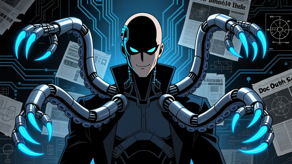
Open any fan-art Discord server on a Friday night and you will see the same pattern within fifteen minutes: somebody drops a Doctor Octopus render into the chat. Maybe it is a chromed-out tentacle close-up with green energy crackling off the tips. Maybe it is a silhouette against a burning Oscorp lab, four arms spread like a steel spider. The reactions are immediate. Doc Ock does not need a caption. Sixty-plus years after Steve Ditko first sketched a portly scientist with a mechanical harness, Otto Octavius remains one of the most visually legible villains in comics—and one of the most remixed characters in the PNG art asset ecosystem.
If you have ever typed "doc ock png" into a search bar at 2 AM looking for a clean transparent render to composite onto a wallpaper or thumbnail, you already know the character carries an unusual weight in digital art culture. His design solves problems that plague lesser villains: the tentacles read at any scale, the color palette holds across media, and the silhouette is unmistakable even as a 64-pixel icon. This article traces how that visual identity was built, how it mutated across decades and adaptations, and why the PNG format specifically became the medium through which fans dissect, reassemble, and celebrate one of Marvel's great antagonists.
Four Steel Arms and a Bowler Hat: The Ditko Blueprint
Steve Ditko's original design for The Amazing Spider-Man #3 (cover-dated July 1963) was almost aggressively unglamorous. Otto Octavius was a stocky, middle-aged man in a green suit and brown bowler hat, with four telescoping mechanical tentacles bolted to a chest harness. The tentacles themselves were segmented, pincer-tipped, and colored in flat metallic grays and olive greens. There was nothing sleek about them. They looked industrial—like equipment you would find in a 1960s nuclear research lab, which is exactly what Ditko intended.
The genius of that first design was its silhouette. Even in Ditko's relatively restrained rendering, the tentacles created a radial shape that broke from the standard two-arms-two-legs human outline. When Doc Ock stood with all four arms extended, he occupied a visual zone normally reserved for cosmic or monstrous characters. A guy in a suit was suddenly taking up the same compositional space as Galactus. That tension—mundane body, monstrous extension—is the core of the character's visual identity, and every subsequent redesign has either embraced it or fought against it.
The color choices in those early issues also established a palette that persists in fan renders to this day. The green of Octavius's suit jacket, the yellow-brown of the harness, the chrome-gray of the tentacles—these three tones form what colorists sometimes call the "Doc Ock triad." Search for doc ock PNG files on any asset-sharing platform and you will see this triad repeated across thousands of images, from pixel-perfect comic scans to fully rendered 3D compositions.
John Romita Sr. and the Purple-Yellow Reinvention
When John Romita Sr. took over Spider-Man art duties, he overhauled nearly every character in the book. Doctor Octopus got one of the most dramatic makeovers. Gone was the green suit. In its place: a mustard-yellow bodysuit with dark green (sometimes rendered as teal or black-green) pants and boots. The harness became bulkier, the tentacle actuators more prominent, and the overall look shifted from "absent-minded physicist" to something closer to a proper supervillain costume.
This purple-and-yellow era—which ran roughly from 1966 through the early 1980s, with variations—is the version most deeply embedded in pop-culture memory. It is the Doc Ock of the 1967 animated series, the one that appeared on lunchboxes and trading cards, and the design that most fan artists reach for when they want to evoke "classic" Spider-Man villainy. The high-contrast color blocking (warm yellow against cool green-purple accents) photographs well, scales cleanly, and reads as villainous without requiring any anatomical distortion.
For PNG asset creators, the Romita-era design presents a specific advantage: the bold, flat color areas compress beautifully in PNG-8 format. A 600-pixel-tall classic Doc Ock render at 8-bit color depth weighs in at roughly 45-80 KB, making it practical for web composites, forum signatures, and social media overlays. Modern renderers still exploit this, which is why so many "retro-style" Doc Ock PNGs circulating on DeviantArt and Pinterest use deliberately flat shading even when the source art is digitally painted.
The Harness as Character
One element that rarely gets discussed in visual analyses of Doctor Octopus is the harness itself—the band of metal that wraps around his torso and connects the tentacles to his nervous system. In Ditko's version, it was almost invisible under his jacket. By the Romita era, it had become a visible chest plate, often drawn with rivets, seams, and a central power unit. In Mark Bagley's Ultimate Spider-Man run (2000-2007), the harness became a full spinal column of interlocking plates that fused directly to Octavius's skeleton.
The harness matters because it is the visual bridge between "man" and "machine." A Doc Ock render without a clearly defined harness reads as incomplete—the tentacles appear to float, disconnected from any narrative logic. The best fan-made PNG assets always give the harness careful attention: specular highlights on the metal, shadow where it bites into fabric or skin, and at least a suggestion of the connection point where steel meets spine.
Superior Spider-Man: When Doc Ock Stole the Suit
The 2013 Superior Spider-Man storyline, written by Dan Slott with art by Ryan Stegman and others, created a visual anomaly that the PNG community still mines aggressively. Otto Octavius, having swapped minds with Peter Parker, took over the Spider-Man identity and redesigned the costume. The result was a black-and-red suit with spider-legs emerging from the back—essentially Doc Ock's tentacle motif grafted onto Spider-Man's body.
From a design standpoint, the Superior suit was controversial. Longtime Spider-Man fans found the angular, armored look jarring compared to the classic red-and-blue. But as a PNG asset, it was a gift. The sharp contrast between black base and red accents, combined with the mechanical spider-legs rendered in chrome and gunmetal, produced images that punched through any background. Wallpaper communities on Reddit and DeviantArt saw a surge of Superior Spider-Man renders in 2013-2014, and the design retains a cult following in composite art to this day.
What makes the Superior era particularly useful for asset creators is the duality it represents. A single PNG of the Superior Spider-Man carries two characters' visual information: Spider-Man's silhouette and Doc Ock's mechanical appendages. Fan editors regularly split these renders, extracting the spider-legs to graft onto other characters or isolating the suit for "what-if" composite scenarios. The modular nature of the design—organic body plus detachable mechanical elements—maps perfectly onto the layer-based workflows that PNG compositing demands.
Alfred Molina and the MCU Translation
Sam Raimi's Spider-Man 2 (2004) gave audiences the first fully realized live-action Doctor Octopus, played by Alfred Molina. The film's tentacle design, supervised by effects house Sony Pictures Imageworks, departed significantly from the comics. The arms were thicker, more organic-looking, with a brushed-steel finish and glowing red "eyes" at each pincer tip. The harness was hidden under Molina's clothing for most of the film, emerging only in action sequences. And the color palette was almost entirely metallic: silver, gunmetal gray, and that sinister red glow.
The film design solved a practical problem that the comics never had to address: how do four mechanical arms read on screen without obscuring the actor's face? The answer was verticality. The tentacles arched high above Molina's head in a fan shape, creating a crown-like silhouette that framed his performance rather than hiding it. This "crown" pose became the default for promotional imagery, DVD covers, and—predictably—the most widely circulated PNG renders of the film version.
When Molina reprised the role in Spider-Man: No Way Home (2021), the tentacles received a CGI overhaul. The new design was sleeker, with a nanotech-inspired surface texture that could shift and reconfigure. The red eyes were brighter, the articulation more fluid, and the overall aesthetic shifted from "industrial machinery" to something closer to "biotech weapon." For PNG artists, the No Way Home version introduced new surface detail challenges: the nanotech texture requires higher bit-depth PNG-24 or even PNG-48 rendering to avoid banding artifacts in the metallic surfaces.
"The tentacles are a character. They are not props. When I am performing with them, I am performing with four scene partners who happen to be attached to my back." — Alfred Molina, interview with Empire magazine (2021)
Anatomy of a Tentacle: The Design Detail That Makes or Breaks a Render
Strip away the costumes, the color palettes, and the adaptations, and Doctor Octopus's visual identity rests on a single element: the tentacle. Get the tentacle right and almost everything else is forgivable. Get it wrong and no amount of careful coloring will save the image. This is why the tentacle has its own informal "spec sheet" in fan-art communities, passed around on forums and documented in DeviantArt tutorials.
A properly rendered Doc Ock tentacle has four distinct zones. The base segment connects to the harness and is typically the thickest, with visible hydraulic or pneumatic housings. The mid-section tapers and introduces the characteristic ribbed or segmented flexibility that allows the arm to curve. The fore-section narrows further and often features finer articulation joints. And the pincer tip—the business end—usually terminates in three or four claw-like digits that can grip, crush, or manipulate objects with precision.
In Ditko's original design, the tentacles had only three segments and a simple claw. By the 1990s, artists like Mark Bagley and John Byrne had extended the arms to five or six visible segments with more complex pincers. The Spectacular Spider-Man animated series (2008) went further, giving each tentacle a unique personality reflected in its movement patterns and tip shape—one arm had a drill bit, another a welding torch, another a sensor array, and the fourth a standard claw. This variation is a favorite among PNG creators because it adds visual interest without requiring additional characters in the frame.
The "Green Glow" Convention
One visual convention that has no canonical source but has become nearly universal in fan renders is the green energy glow emanating from the tentacle tips or the harness connection points. Comics Doc Ock has never consistently glowed green—his energy signatures, when depicted, tend to be white, yellow, or blue depending on the era. But somewhere in the early 2010s, fan artists began rendering Doc Ock's tentacle tips with a bright, neon-green luminance, likely influenced by the broader association of green with "science," "radiation," and "toxic energy" in visual shorthand.
The convention stuck. By 2016, a majority of Doc Ock renders tagged on major art-sharing platforms included some form of green glow, whether as a rim light, a particle effect, or a full volumetric emission from the tentacle tips. It is now so expected that official marketing materials have begun incorporating it: the Marvel's Spider-Man video game (Insomniac, 2018) gave Doc Ock's tentacles a faint green-white energy pulse during certain combat animations, and Spider-Man 2 (Insomniac, 2023) made the green glow a prominent part of his boss-fight visual effects.
Costume Evolution at a Glance
| Era / Source | Primary Colors | Tentacle Style | Harness Visibility |
|---|---|---|---|
| Ditko Original (1963) | Green suit, brown hat, gray arms | 3-segment, simple pincer | Hidden under jacket |
| Romita Sr. (1966-1980s) | Mustard yellow, green-teal accents | 4-segment, claw tips | Visible chest plate |
| Bagley / Ultimate (2000-2007) | Black, chrome, white undersuit | Multi-segment, nanotech feel | Full spinal plate fusion |
| Raimi Film (2004) | Brushed steel, red pincer glow | Thick, organic-curve, AI-controlled | Hidden (emerges in action) |
| Superior Spider-Man (2013) | Black-red suit, chrome legs | Spider-leg configuration | Integrated into suit |
| Insomniac Game (2018) | Dark gray, green-white energy | Segmented, tool-tip variants | External backpack unit |
| No Way Home (2021) | Nanotech silver, red eyes | Fluid, reconfiguring surface | Neural-linked spinal mount |
The PNG Ecosystem: How Fans Build, Share, and Remix Doc Ock Assets
The PNG format occupies a specific niche in fan-art culture that sits between raw illustration and finished composite. A "PNG" in this context does not just mean an image saved in Portable Network Graphics format—it means a character render on a transparent background, cut cleanly from its source, ready to be dropped onto any composition. Entire communities on DeviantArt, Reddit's r/Spiderman, and niche Discord servers exist primarily to produce, curate, and trade these assets.
Doc Ock is disproportionately well-represented in this ecosystem for three reasons. First, his tentacles create complex edge geometry that is genuinely challenging to extract cleanly, which means a well-cut Doc Ock PNG demonstrates technical skill. Second, the character appears across enough media (comics, two animated series, three live-action films, four video games) that there is a constant supply of new source material to render. Third, the tentacles themselves function as compositional tools: a single Doc Ock render can provide framing, leading lines, and depth layering in a composite image, reducing the need for additional elements.
The Render Pipeline
Experienced PNG creators follow a loosely standardized pipeline when producing a Doc Ock asset. The process typically starts with source selection—choosing a comic panel, film screenshot, or game capture with good lighting and a clear view of the character. From there, the extraction work begins in Photoshop, GIMP, or Krita, using pen-tool paths to trace the character outline. The tentacles are the bottleneck: each arm requires careful pathing around every segment joint, every specular highlight on the metal, and every shadow where the arm crosses over the body or another arm.
After extraction comes the cleanup phase. Source art often has compression artifacts, panel-line bleed, or color contamination from adjacent elements. A thorough cleaner will rebuild lost edge detail pixel by pixel, correct color values to match a known reference palette, and add or enhance shadows to give the render dimensional presence on a transparent background. For a complex Doc Ock pose with all four tentacles extended, this process can take 6-10 hours of focused work, which explains why high-quality renders command respect (and sometimes payment) in asset-trading communities.
The final output is almost always saved in PNG-24 with full alpha transparency. File sizes for a detailed, full-body Doc Ock render at 2000-3000 pixels tall typically range from 1.2 MB to 4.8 MB, depending on the complexity of the tentacle geometry and the amount of semi-transparent detail (glows, energy effects, motion blur) included. Some creators produce "HD render" versions at 4K resolution for print-quality composites, which can push file sizes past 12 MB.
Insomniac's Doc Ock: A Case Study in Render-Ready Design
Insomniac Games' portrayal of Doctor Octopus in Marvel's Spider-Man (2018) deserves separate mention because the character model was, whether intentionally or not, almost perfectly optimized for PNG extraction. The design featured a heavy, industrial harness with clearly defined attachment points for each tentacle. The arms themselves were segmented with visible joints, each painted in a distinct gunmetal finish with orange-yellow hydraulic accents. The character's civilian clothing—a rumpled white lab coat over a dark shirt—provided strong value contrast that made edge detection straightforward.
Within weeks of the game's release, fan-made renders of Insomniac's Doc Ock flooded asset-sharing platforms. The game's photo mode, which allowed players to freeze the action, adjust lighting, and capture high-resolution screenshots, effectively served as a built-in source-material generator. Players could pose the character, set up dramatic lighting, and export clean reference images that were ideally suited for extraction. This feedback loop between game design and fan-art production was not unique to Doc Ock, but the character's visual complexity made him a particularly rewarding subject.
The Silhouette Test: Why Doc Ock Works at Every Scale
A useful exercise in character design analysis is the silhouette test: black out the character completely and see if the shape is still recognizable. Doctor Octopus passes this test at virtually every scale, from a full-page comic splash down to a 16x16 pixel favicon. The four tentacles create a radial expansion that no other Spider-Man villain possesses. Venom has bulk, Green Goblin has the glider, Magneto has the cape—but Doc Ock has reach. His silhouette extends outward in ways that fill space and command attention.
This property makes him exceptionally useful in graphic design contexts where space-filling is important: YouTube thumbnails, Twitch overlays, podcast cover art, and social media banners. A Doc Ock render placed in the corner of a thumbnail can extend tentacles across the entire frame, creating visual structure without requiring additional design elements. Content creators in the comic-book commentary space have recognized this utility, and Doc Ock PNGs appear in video thumbnails at a rate noticeably higher than other Spider-Man villains, based on informal surveys of popular comic-book YouTube channels throughout 2023-2025.
The silhouette advantage also translates to animation and motion graphics. When Doc Ock appears in fan animations or After Effects composites, the tentacles provide natural motion paths and easing curves. A single tentacle sweep can fill two seconds of screen time with fluid, organic movement that would require far more keyframe work for a standard humanoid character. This efficiency is one reason Doc Ock appears so frequently in fan-made "versus" battle animations on YouTube, where production speed matters and visual impact per frame is the primary metric.
Fan Render Conventions You Will Actually See
Spend enough time browsing Doc Ock PNG collections and certain patterns emerge that go beyond the official source material. These are conventions invented by the fan-art community itself, repeated so often that they have become part of the character's informal visual vocabulary:
- The "thinking pose" — One tentacle holding the chin, two arms folded, the fourth gesturing outward. This pose has become shorthand for "scheming genius" and appears in roughly a third of all fan-made Doc Ock character sheets.
- The "crown" spread — All four tentacles arched above the head in a symmetrical fan, directly referencing the Raimi film's promotional imagery. Almost always paired with a downward camera angle to emphasize dominance.
- Tentacle-tip close-ups — Extreme renders focusing on a single pincer gripping an object (a chess piece, a Spider-Man mask, a crushed piece of machinery). These function as detail showcases and are popular in asset packs.
- The " Superior hybrid" — Doc Ock's body wearing the Superior Spider-Man suit, with both sets of appendages (spider-legs and tentacles) visible simultaneously. Technically non-canonical, but visually dense and popular in composite battle scenes.
- Green-tinted composites — Full renders bathed in a green color grade, reinforcing the "radiation/mad science" association. Often paired with floating mathematical or chemical formulae in the background.
Where to Source Quality Doc Ock PNGs (and What to Watch For)
The quality range across publicly available Doc Ock PNG assets is enormous. At the low end, you find badly extracted renders with jagged edges, color fringing, and incomplete transparency cleanup—the kind of asset that looks fine at 200 pixels but falls apart the moment you scale it up or place it against a contrasting background. At the high end, hand-cleaned, 4K renders with proper alpha channels and edge refinement that could pass for official press-kit material.
The most active communities for quality Doc Ock renders remain DeviantArt's "PNG & Renders" gallery system, the r/png and r/Spiderman subreddits, and several dedicated Discord servers focused on comic-book asset trading. When evaluating a render, pay attention to the edge quality around the tentacle joints (the most common failure point), the consistency of specular highlights across all four arms (inconsistent lighting betrays a composite source), and the presence of any residual background color in the alpha channel. A clean render should look natural against both dark and light backgrounds without visible halos or dark fringing.
For creators who want to produce their own assets rather than source existing ones, the Insomniac games remain the single best starting point. The photo mode tools, combined with the character model's clean design and strong material separation, make extraction significantly more approachable than working from comic panels (where line art, color flats, and shading layers are all merged into a single image) or film screenshots (where compression, motion blur, and depth-of-field effects complicate edge work).
Frequently Asked Questions
What makes Doctor Octopus PNGs more popular than other Spider-Man villain renders?
It comes down to compositional utility. Doc Ock's tentacles serve double duty as both character design and layout element. A Green Goblin render gives you a guy on a glider. A Doc Ock render gives you a character plus four dynamic lines that can frame text, guide the viewer's eye, or fill negative space. That extra utility makes him more versatile in composite work, which drives higher demand in asset-sharing communities.
Is the green glow on Doc Ock's tentacles canon?
Not consistently. The green glow is primarily a fan-art convention that gained traction around 2014-2016 and has since been partially adopted by official media (Insomniac's games, some recent comic covers). In the source comics, Doc Ock's tentacles do not typically emit any light. The glow exists because it solves a visual problem: on a transparent PNG, the tentacle tips can look visually "dead" without some form of energy signature to anchor them.
Which Doc Ock design is the most commonly rendered by fans?
Based on tagging frequency across major platforms, the Insomniac game version (2018) currently holds the top spot, followed by the Raimi film version (Alfred Molina), and then the classic Romita-era comic design. The No Way Home nanotech version has been climbing since 2022. The Ultimate Comics version and the Spectacular Spider-Man animated version have smaller but dedicated followings.
What resolution should a good Doc Ock PNG be?
For web use (thumbnails, social media, forum signatures), 800-1200 pixels tall is sufficient. For print-quality composites or wallpaper creation, aim for 2000-3000 pixels minimum. Renders above 4000 pixels are considered "HD" in asset communities and are typically reserved for detailed character sheets or portfolio pieces. Always save in PNG-24 with alpha transparency—PNG-8 will cause visible banding on metallic surfaces and gradient glows.
How long does it take to create a quality Doc Ock render from scratch?
For an experienced digital artist working from a clean source image, expect 4-8 hours for a standard full-body render with all four tentacles visible. Complex poses with overlapping arms, dramatic lighting, or added effects (glows, particles, environmental reflections) can push the timeline to 10-15 hours. Beginners working from comic panels with merged layers should budget significantly more time for the cleanup and edge-reconstruction phases.
◆ SenpaiSite — Otaku Culture / Marvel — "doc ock png" — 2026