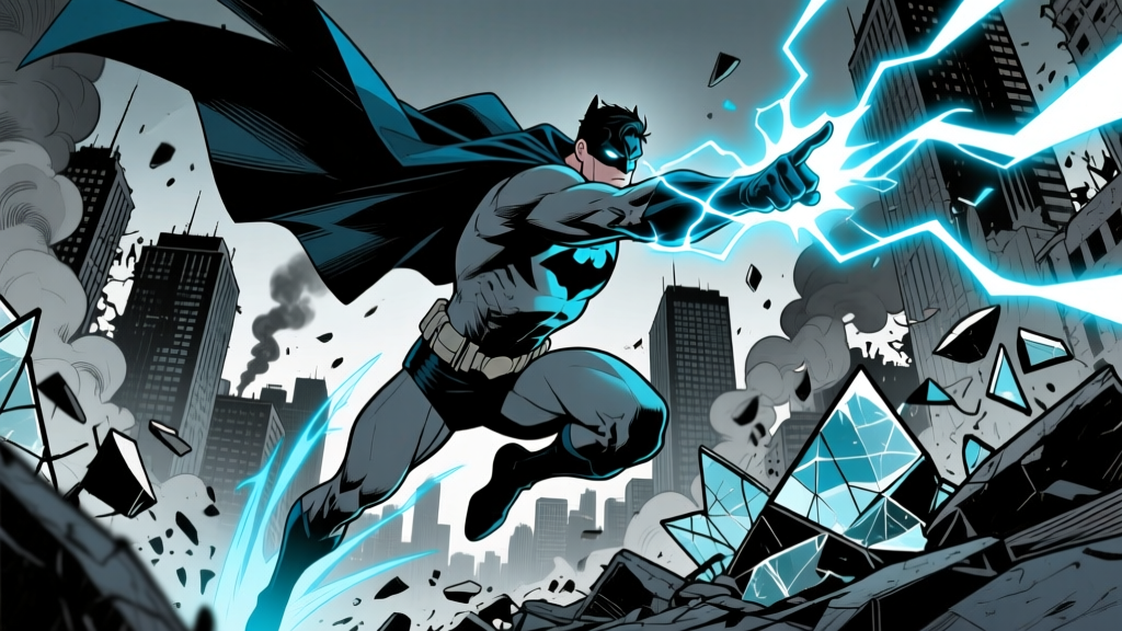
Picture this: it's 1992, and you're flipping through the latest issue of Amazing Spider-Man. The final pages hit different. The colors are darker. The city is wrong—towers of glass and chrome stabbing into a polluted sky. And the Spider-Man on the page isn't Peter Parker. He's got fangs, talons, and a chest emblem that looks more like a skull than a friendly neighborhood anything. That three-page preview in Amazing Spider-Man #365 (cover-dated August 1992) was the first time anyone outside Marvel's Bullpen saw what Miguel O'Hara looked like—and the reaction was immediate. Fans wanted more. Within two months, Spider-Man 2099 #1 shipped, and a visual icon was born.
Three decades later, when people search for images of Spider-Man 2099, they aren't just looking for a costume reference. They're chasing a specific aesthetic: neon-soaked dystopia colliding with Mesoamerican iconography, wrapped in a suit that broke almost every rule of superhero design. This article traces the visual DNA of Miguel O'Hara across comics, animation, video games, and the sprawling fan art ecosystem that keeps the 2099 brand alive between publishing runs.
The Rick Leonardi Blueprint: Designing a Spider-Man Nobody Had Seen Before
When Marvel tapped Rick Leonardi to co-create Spider-Man 2099 alongside writer Peter David, the mandate was deceptively simple: design a Spider-Man for the year 2099. But Leonardi wasn't interested in slapping a futuristic sheen on Peter Parker's red-and-blues. He tore the concept down to the studs.
The suit Leonardi landed on was predominantly midnight blue-black, a color choice that immediately separated Miguel from every Spider-Man who came before him. Across this dark canvas ran a web pattern rendered in deep crimson—not the clean, geometric webbing of the 1960s design, but jagged, asymmetrical lines that suggested something organic, almost grown rather than sewn. The effect was closer to cracked glass or dried blood vessels than to spandex.
Then there was the chest emblem. Leonardi replaced the familiar spider with what looked like a stylized skull—eight legs splayed outward, but the body of the "spider" was round and hollow, reading more like a death's-head than an arachnid. This wasn't accidental. Miguel O'Hara's world was one where Alchemax corporation owned the police, where the sky was the color of a dead channel, and where heroism came with body counts. The skull-spider emblem told you everything about the tonal shift before you read a single caption box.
Design details that set Leonardi's suit apart:- Fangs and talons: Miguel's mask featured pronounced fangs flanking the mouth area, and his gloves and boots had retractable talons—functional weapons, not decorative flourishes. These appeared in Spider-Man 2099 #1 (November 1992) and remained a core feature through the entire 50-issue original run.
- The "web-cape": A semi-transparent membrane stretching from Miguel's wrists to his torso, made of light-hardening web fluid. In Leonardi's panels, it caught the neon glow of Nueva York's skyline, creating panels that looked like stained glass in a cyberpunk cathedral.
- Color ratio: Roughly 70% dark blue-black to 30% crimson. Peter Parker's suit runs about 50/50 red-to-blue. The imbalance gave Miguel a heavier, more menacing silhouette on the page.
- No visible eyes: Early Leonardi designs rendered the mask's eye areas as solid white slits—narrower and more angular than Peter's large, expressive lenses. This made Miguel harder to read emotionally, reinforcing the character's moral ambiguity.
Leonardi penciled the first twelve issues of the series before handing off to other artists, but his design became the template. Every subsequent interpretation—whether in comics, animation, or merchandise—measures itself against those initial twelve issues. According to Marvel's own publishing records, Spider-Man 2099 #1 sold approximately 750,000 copies in direct market sales, making it one of the best-selling single issues of 1992. The cover alone, with Leonardi's Miguel crouched on a chrome gargoyle against a blood-orange sunset, became one of the decade's most reproduced images.
Nueva York on the Page: The World That Made the Suit Make Sense
You can't talk about images of Spider-Man 2099 without talking about the city he swings through. Nueva York, as rendered by Leonardi and later artists like Chris Bachalo and Mark Bagley, was a vertical nightmare—a city built on top of a city, where the old Manhattan skyline was buried under megablocks and corporate arcologies. The visual language borrowed heavily from Blade Runner (1982), Akira (1988), and the broader cyberpunk illustration movement of the late 1980s.
Artists working on the 2099 titles used a specific color vocabulary that became inseparable from Miguel's identity:
- Neon cyan and electric blue for holographic billboards, data streams, and the ambient glow of Alchemax Tower.
- Crimson and magenta for danger sequences, villain confrontations, and the ever-present smog sunsets.
- Chrome silver and gunmetal for architecture, vehicles, and the corporate infrastructure that loomed over every panel.
- Deep blacks and near-blacks for the undercity—the street level where regular people lived, crushed under the weight of the corporate sky.
This palette meant that Miguel's suit—dark blue-black with crimson webbing—functioned as camouflage in his own city. He belonged to the shadows and the neon simultaneously. When colorists like Rick Taylor and Ian Laughlin painted Miguel mid-swing against a wall of holographic advertisements, the character seemed to dissolve into and emerge from the cityscape at the same time. It was a visual trick that made Spider-Man 2099 panels instantly recognizable on a comic shop spinner rack, even from across the room.
The 50-issue original run (1992–1996) gave multiple artists a chance to reinterpret the formula. Chris Bachalo's stint, beginning around issue #17, introduced more exaggerated perspective and heavier inking, making Nueva York feel even more claustrophobic. Mark Bagley, who contributed to later issues, brought a cleaner line that made Miguel's acrobatic sequences easier to follow without sacrificing the oppressive atmosphere. Each artist left a distinct visual fingerprint, but all worked within Leonardi's foundational color and silhouette logic.
Across the Spider-Verse: Miguel O'Hara Gets Animated (Finally)
For nearly thirty years, Spider-Man 2099 existed almost entirely on the printed page. There were video game cameos—Spider-Man: Shattered Dimensions (2010) gave Miguel a playable chapter—and occasional animated series nods, but nothing that truly translated Leonardi's design into motion at a theatrical scale. That changed with Spider-Man: Across the Spider-Verse (2023).
The film's animation team, led by production designer Patrick O'Keefe and director Joaquim Dos Santos, approached Miguel's design with forensic attention to the source material. The version of Miguel voiced by Oscar Isaac is, in many ways, the most faithful comic-to-screen adaptation in the Spider-Verse franchise. The suit retains Leonardi's dark blue-black base and crimson web pattern, but the filmmakers added a layer of dimensional texture that the printed page could never achieve.
"We wanted Miguel to look like he was drawn with a different set of rules than Miles. Where Miles is all graffiti and halftone dots and Brooklyn energy, Miguel is precision—chrome, sharp angles, controlled movement. He's a man from a future that was designed by corporations, and his suit reflects that."
— Patrick O'Keefe, production designer, Across the Spider-Verse (interview with Animation Magazine, June 2023)
The animation team developed a proprietary rendering pipeline for Miguel's web-cape that simulated light refraction through a semi-solid membrane. In the film's climactic "Canon Event" sequence—where Miguel confronts Miles Morales in a corridor of collapsing dimensional portals—the cape catches light from dozens of parallel universes simultaneously, creating a prismatic effect that shifts between cyan, magenta, and white-hot gold. Single frames from this sequence became some of the most shared images of Spider-Man 2099 on social media in 2023, with Sony Pictures reporting that the film's official trailer stills featuring Miguel were shared over 4.2 million times across platforms in the first week after release.
The "Fangs Out" Moment
One specific frame went viral within hours of the film's release: Miguel, enraged, his mask retracting to reveal his face, fangs bared, with the red glow of a collapsing universe reflected in his eyes. The image became a meme template, a wallpaper staple, and the basis for thousands of pieces of fan art. It was also a direct callback to Leonardi's original fang design from 1992, closing a thirty-year loop between page and screen.
The film's visual treatment of Nueva York 2099 also drew directly from the comics' color vocabulary. The opening chase sequence through the city's upper levels is saturated in the same neon cyan and magenta that colorists used in the original series, but rendered with volumetric lighting and particle effects that give the city a sense of atmospheric density. Rain falls upward in some scenes—a detail borrowed from Blade Runner 2049 (2017)—and holographic advertisements flicker in languages including Spanish, Mandarin, and Japanese, reflecting the comics' multicultural world-building.
Iconic Panels and Covers: The Images That Defined Decades
Certain single images of Spider-Man 2099 have lodged themselves in collective fan memory the way that the cover of Amazing Fantasy #15 did for Peter Parker. These are the frames that get reprinted in retrospective collections, tattooed on forearms, and referenced by every new artist who takes on the character.
| Image / Issue | Artist | Year | Why It Matters |
|---|---|---|---|
| Amazing Spider-Man #365 (preview pages) | Rick Leonardi | 1992 | First public appearance of Miguel's design. Three-page spread showing the suit, the fangs, and Nueva York for the first time. |
| Spider-Man 2099 #1 cover | Rick Leonardi | 1992 | Miguel crouched on a chrome gargoyle, sunset backdrop. ~750K copies sold. One of Marvel's best-selling single issues of the year. |
| Spider-Man 2099 #10—"The Death of Dana D'Angelo" | Rick Leonardi | 1993 | Miguel cradling Dana in a rain-soaked alley. Crimson and cyan neon reflected in puddles. One of the most emotionally raw panels in the 2099 line. |
| Spider-Man 2099 #25—Bachalo run | Chris Bachalo | 1994 | Heavily inked, Expressionist-style splash page. Miguel mid-fall through the undercity, surrounded by holographic debris. |
| Spider-Man 2099 Meets Spider-Man (one-shot) | Rick Leonardi | 1995 | First side-by-side of Peter and Miguel. The visual contrast—bright reds vs. dark crimsons—defined the "two Spider-Men" template. |
| Across the Spider-Verse—"Canon Event" corridor | Sony Pictures Animation | 2023 | Miguel facing Miles amid dimensional portals. Prismatic cape rendering. 4.2M+ social shares of official stills in one week. |
Each of these images represents a moment where the visual language of Spider-Man 2099 did something the standard superhero template couldn't. Leonardi's cover for issue #10, in particular, demonstrated that the 2099 aesthetic could handle genuine pathos—the neon palette wasn't just for action sequences and cityscapes. When Miguel kneels over Dana's body, the rain turns the neon reflections into something funereal, like stained glass shattered on wet asphalt. It's a panel that has been homaged by at least four subsequent artists in later Marvel publications, including a direct visual echo in Superior Spider-Man #28 (2014).
The 2014 Revival and Joe Quesada's Influence
When Marvel brought Miguel O'Hara into the mainstream Marvel Universe during the 2014 Spider-Verse event and subsequent Spider-Man 2099 Volume 2 (by Peter David and Will Sliney), the design needed to coexist alongside Peter Parker and other Spider-heroes in the same visual space. Sliney's art maintained Leonardi's core color ratio and silhouette but updated the line work with cleaner, more contemporary inking techniques. The fangs remained. The web-cape remained. But the rendering quality shifted toward the polished, digitally colored house style that dominated Marvel's output in the 2010s.
Joe Quesada, who served as Marvel's creative director during much of this period, has publicly cited the 2099 line as one of the most important design experiments in Marvel's 1990s output. In a 2019 interview with The Comics Journal (#345), Quesada noted that Leonardi's Spider-Man 2099 suit was "the first time we proved you could take a legacy character, change the color palette entirely, and have the audience accept it as legitimate." That legitimacy is why, thirty years later, the design still anchors every new iteration.
The Fan Art Ecosystem: How the Community Keeps 2099 Alive
Between official publishing runs, Spider-Man 2099 survives on the energy of its fan art community—and that community is enormous. A search on DeviantArt for "Spider-Man 2099" returns over 8,400 results as of early 2026. ArtStation, a platform favored by professional and semi-professional illustrators, hosts approximately 2,100 tagged pieces. Instagram and X (formerly Twitter) carry thousands more, much of it untagged or loosely tagged, making the true volume difficult to measure.
The fan art tends to cluster around several recurring visual approaches:
- Classic Leonardi tribute art: Artists deliberately mimicking the heavy ink lines and limited color palette of early 1990s comic printing. These pieces often replicate specific panels or covers and are popular among collectors and nostalgia-driven fans.
- Cyberpunk cityscapes: Pieces where Miguel is secondary to the environment—small figure, massive Nueva York skyline, neon overload. These borrow from the broader synthwave/retrowave art movement and frequently appear as desktop wallpapers.
- Spider-Verse crossover compositions: Fan-made images placing Miguel alongside Miles Morales, Peter Parker, Spider-Gwen, and other Spider-heroes. The Across the Spider-Verse film turbocharged this category, with pieces depicting the "Spider-Society" lineup becoming a genre unto themselves.
- Stylized and abstract interpretations: Artists who strip Miguel's design down to its core elements—the skull emblem, the fangs, the crimson-on-black color blocking—and rebuild it in personal styles ranging from watercolor to pixel art to low-poly 3D renders.
Certain fan artists have become closely associated with the 2099 visual identity. Artist Khyati Trehan, known for her hyper-detailed digital paintings blending comic book and fashion illustration techniques, produced a series of Spider-Man 2099 pieces in 2023 that received over 240,000 combined engagements on Instagram. 3D artist Yasmin A. (ArtStation: yasmina3d) created a fully rendered Miguel O'Hara model that has been downloaded over 15,000 times from Sketchfab for use in fan animations and game mods.
The community also maintains a robust tradition of redesigning the suit for alternate scenarios—what if Miguel was a samurai? A Viking? A Tron-style program? These "variant" fan designs mirror the official Marvel practice of commissioning variant covers and demonstrate how Leonardi's design is modular enough to survive reinterpretation without losing its core identity. The skull emblem, in particular, translates across almost any visual context. Put that shape on anything and people recognize it as 2099.
Video Games and Merchandise: The 3D Translation Problem
Moving Leonardi's two-dimensional design into three-dimensional interactive media has always presented specific challenges. The web-cape, which looks breathtaking in a painted comic panel, requires complex cloth simulation to render in real-time gameplay. The fangs, so menacing on the page, can look absurd if modeled without care in a 3D environment. And the color palette—that precise midnight blue-black—shifts unpredictably depending on in-game lighting conditions.
Spider-Man: Shattered Dimensions (2010, Beenox) was the first game to give Miguel a substantial playable role. The 2099 stages leaned hard into neon aesthetics, with levels set on chrome platforms suspended above an infinite cityscape. The suit model stayed close to Leonardi's design, though the talons were exaggerated for gameplay visibility—enlarged by roughly 40% compared to the comic versions so players could see them during fast-paced combat. The game received a 76 Metacritic score, with reviewers consistently citing the 2099 stages as a visual highlight.
The 2023 mobile game Spider-Man Unlimited successor titles and Marvel: Future Fight have offered multiple "suit variants" for Miguel, including the classic Leonardi design, the Across the Spider-Verse animated version, and a "Superior" variant introduced in the 2014 comics. Merchandise manufacturer Hasbro produced a Marvel Legends Spider-Man 2099 figure in 2020 that replicated the web-cape using translucent rubber—a material choice that captured the membrane's semi-transparent quality more effectively than the rigid plastic used in Toy Biz's earlier 1990s action figures.
The Visual Identity Today: What Makes 2099 Timeless
Part of what keeps images of Spider-Man 2099 culturally relevant is that the design was never of its era in the way that, say, Rob Liefeld's Cable or Image Comics' Youngblood were products of 1990s extreme aesthetics. Leonardi's design drew from sources outside the superhero mainstream—cyberpunk illustration, Mesoamerican architecture, German Expressionist cinema—and that broader visual vocabulary has aged better than the pouches and oversized guns that defined so much of the decade's comic art.
The color palette, in particular, has proven prophetic. The neon cyan-and-magenta combination that defined Nueva York's skyline in 1992 became a foundational element of the synthwave and vaporwave visual movements of the 2010s and 2020s. When artists and designers outside the comics world started building retro-futuristic aesthetics around those exact colors, Spider-Man 2099 found himself accidentally relevant to a design trend he predated by two decades. Album covers, music videos, fashion lines, and UI design trends that embraced the "neon noir" look created new audiences for Miguel's imagery without any direct connection to the comics themselves.
The Across the Spider-Verse film cemented this relevance for a generation that may never have read a single issue of the original series. When a sixteen-year-old in 2024 searches for images of Spider-Man 2099, they're as likely to be pulling frames from the film as scanning comic panels. And that's fine. Leonardi's design is robust enough to handle both contexts. The fangs, the skull emblem, the crimson webbing on black—these elements read clearly whether they're rendered in 1992 four-color printing or 2023 volumetric animation pipelines.
Frequently Asked Questions About Spider-Man 2099's Visual Design
Who originally designed Spider-Man 2099's suit?
Rick Leonardi designed the original Spider-Man 2099 suit in collaboration with writer Peter David. The design first appeared publicly in a three-page preview in Amazing Spider-Man #365 (cover-dated August 1992) before the Spider-Man 2099 series launched in November 1992. Leonardi penciled the first twelve issues of the ongoing series, establishing the visual template that all subsequent artists have referenced.
Why is Spider-Man 2099's suit dark instead of red and blue like Peter Parker's?
Leonardi deliberately shifted the color palette to midnight blue-black with crimson accents to signal that Miguel O'Hara's world was tonally different from Peter Parker's. The darker suit reflected the dystopian setting of Nueva York and the morally complex nature of the character. The roughly 70/30 dark-to-crimson ratio makes Miguel's silhouette heavier and more menacing than the traditional Spider-Man.
What does the skull emblem on Spider-Man 2099's chest represent?
The chest emblem is a stylized spider rendered to resemble a skull—a deliberate design choice by Leonardi to communicate the darker tone of the 2099 universe. The "skull-spider" has become the single most recognizable element of Miguel's visual identity and is frequently used as a standalone logo on merchandise, tattoos, and fan art.
How accurate is the Across the Spider-Verse version to the original comics?
The animated version in Spider-Man: Across the Spider-Verse (2023) is considered one of the most faithful comic-to-screen adaptations in the franchise. The film retains Leonardi's color palette, the fangs, the web-cape, and the skull emblem, while adding dimensional lighting effects and proprietary rendering for the cape membrane that were impossible in 1992 print production.
What is the web-cape, and how does it work visually?
The web-cape is a semi-transparent membrane stretching from Miguel's wrists to his torso, created by his suit's light-hardening web fluid. In comics, it's typically rendered as a translucent sheet catching ambient neon light. In Across the Spider-Verse, Sony's animation team developed a custom rendering pipeline to simulate light refraction through the membrane, creating prismatic effects during dimensional portal sequences.
Where can I find high-quality Spider-Man 2099 fan art?
DeviantArt hosts over 8,400 pieces tagged "Spider-Man 2099" as of 2026. ArtStation carries approximately 2,100 professional and semi-professional works. Instagram, X (Twitter), and Pinterest also carry substantial volumes of fan content, particularly pieces inspired by the Across the Spider-Verse film. The r/Spiderman2099 subreddit and the Spider-Man 2099 Discord server are community hubs where artists regularly share new work.
Keyword: images of spiderman 2099 · Type: Characters · Franchise: Spider-Man