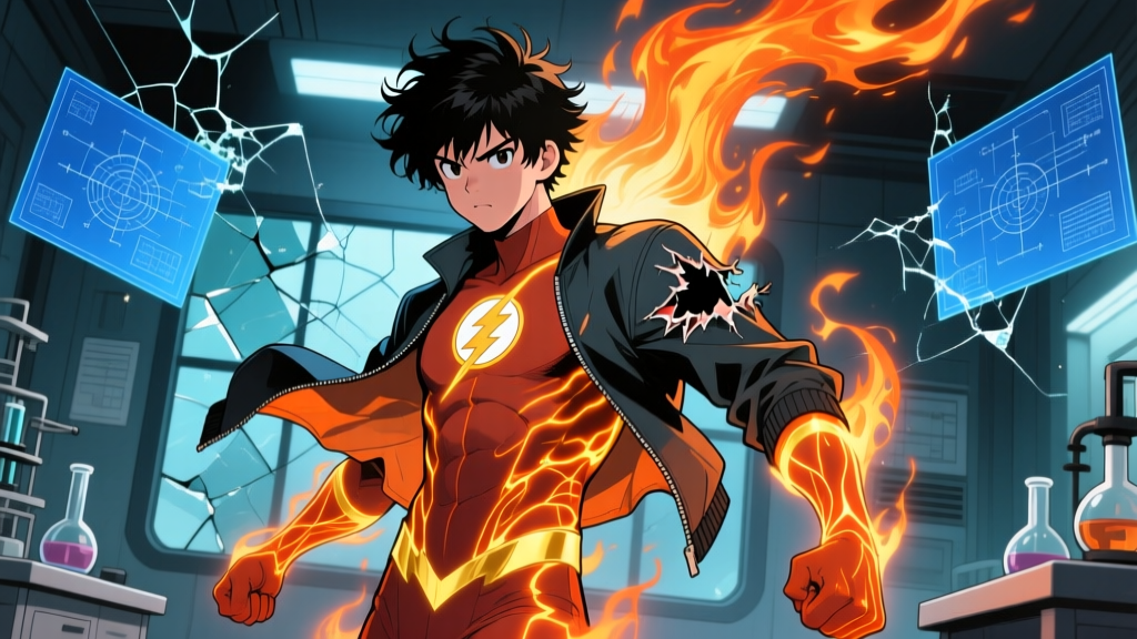
Picture this: four people have just been blasted by cosmic rays during an unauthorized space flight. Their bodies are rewriting themselves at the molecular level. Reed Richards can stretch like rubber. Ben Grimm is turning into a granite boulder. Sue Storm is fading in and out of visibility. And Johnny Storm — the youngest, the loudest, the one who somehow makes spontaneous combustion look effortless — is on fire. His clothes are burning off his body. Every single time he flames on, whatever he's wearing turns to ash.
It's a practical problem that most superhero origin stories conveniently ignore. But Stan Lee and Jack Kirby didn't ignore it. In Fantastic Four #3 (1962), Reed Richards pulled out what would become one of the most enduring pseudo-scientific concepts in comic book history: unstable molecules. A synthetic fabric, engineered by Richards himself, that could stretch with Reed, turn invisible with Sue, endure the Thing's rocky transformation, and — crucially — withstand Johnny's inferno without so much as a singed hem. It wasn't just a plot device. It was the foundation of an entire costume mythology that has evolved across sixty-plus years of comics, three live-action film adaptations, and a merchandising empire worth millions.
The Molecular Magic That Makes It All Work
Here's the thing about unstable molecules that most casual fans never quite grasp: the concept was never meant to be scientifically rigorous. Stan Lee needed a reason for the Fantastic Four's suits to survive their powers, and "unstable molecules" sounded just plausible enough for a 1962 comic reader to buy. The idea, as originally presented, was that Reed Richards had synthesized a polymer whose molecular structure could shift and adapt in response to extreme stimuli. Heat, pressure, dimensional distortion — the fabric would reconfigure itself at the subatomic level rather than tearing, melting, or combusting.
For Johnny specifically, the suit's behavior is fascinating. When he flames on, the unstable molecule fabric doesn't merely resist the heat — it appears to transform with him. In most comic depictions, the suit shifts from its standard blue-and-black appearance into a darker, more streamlined version that sits beneath the flame aura like a second skin. The fabric's thermal tolerance has been inconsistently portrayed over the decades. Some writers treat it as completely impervious. Others have shown it sustaining damage during particularly intense confrontations, such as when Johnny pushed his nova flame ability to its limits in Fantastic Four #509 (2004), written by Mark Waid, where the suit showed visible stress patterns along the torso seams.
The concept has aged surprisingly well. Modern comic writers have layered additional pseudo-science on top of Lee's original idea. In Jonathan Hickman's 2009–2012 Fantastic Four run, the unstable molecule suits were implied to be connected to Reed's broader technological ecosystem — responsive materials that could interface with the team's communication systems and environmental sensors. By that point, the suit had accumulated a surprisingly long list of capabilities:
- Thermal adaptation — reconfiguring molecular bonds to survive temperatures from cryogenic lows to supernova-level heat
- Elastic memory — stretching and contracting with Reed's body without losing structural integrity
- Optic refraction — turning invisible alongside Sue Storm without creating a visible outline
- Kinetic absorption — withstanding the mechanical stress of Ben Grimm's transformations and impacts
- Integrated systems — housing communication arrays, environmental sensors, and life-sign monitors in later iterations
The suit wasn't just fireproof clothing anymore. It was a wearable platform.
Six Decades of Flame: How the Suit Changed on the Page
Costume design in comics is never static. Artists come and go, house styles shift, editorial mandates trickle down from on high. Johnny Storm's suit has weathered all of it, and the results trace a surprisingly clear line through the medium's visual history.
The Kirby Years (1961–1970): Blueprinting the Torch
Jack Kirby's original Human Torch design from Fantastic Four #1 was deceptively simple: a full-body blue bodysuit with the now-iconic chest insignia — a "4" enclosed in a circle, rendered in black. The "4" wasn't just a team identifier. According to The Jack Kirby Collector #25 (1999), Kirby fought for the insignia from the start, arguing that a team of adventurers needed a visual brand, something readers could sketch from memory on a school notebook.
In those earliest issues, Kirby drew Johnny with a full-head mask — blue fabric covering his entire face and head, flame effects swirling around the outside. By Fantastic Four #4, however, the mask was gone. The reasoning was pragmatic and character-driven: Johnny Storm was a celebrity, a young hotshot who wanted to be recognized. Hiding his face behind fabric undercut the whole persona. Kirby's solution became the standard approach: Johnny ignites from the collar up, his flame aura wrapping around his bare head like a crown of living fire while the suit protects everything below the neck. It was a clean visual distinction that made the character instantly recognizable even in silhouette.
The flame rendering itself evolved rapidly. In the first handful of issues, the flames were rudimentary — orange blobs with jagged edges, more campfire than inferno. But by 1964, Kirby had developed a more fluid approach: layered yellows and oranges with white-hot cores near Johnny's body, tapering into deeper reds and ambers at the edges. He treated the flame aura as an extension of Johnny's emotional state, a visual language that subsequent artists would inherit and expand.
Byrne's Definitive Overhaul (1981–1986)
When John Byrne took over Fantastic Four in 1981, he brought a sharper, more angular art style and a willingness to interrogate every aspect of the book's mythology. Byrne's Johnny Storm was less the lovable hothead and more a genuinely complicated young man grappling with the weight of his abilities. The suit reflected that shift. Byrne's blue was noticeably darker — closer to navy than primary blue — and he rendered the flame effects with a painter's attention to light and shadow.
The key innovation in Byrne's run was his treatment of the flame aura as an actual light source. Earlier artists had drawn flames around Johnny without considering how that light would interact with the suit or the environment. Byrne cast warm orange and yellow reflections across the blue fabric of Johnny's chest and arms. The suit glowed from within during flame-on sequences, and the contrast between the cool blue and the warm fire tones became a visual signature. According to Byrne's own commentary in Modern Masters Volume 2: John Byrne (2004), he considered the Human Torch the most technically demanding character to draw in the Fantastic Four lineup, specifically because of the lighting challenges the flame effects created.
Byrne also standardized the insignia. In Kirby's era, the "4" emblem had varied considerably between issues — sometimes hand-drawn, sometimes abstracted, occasionally off-center. Byrne's version was clean, geometric, and consistently placed on the left chest. It became the definitive insignia that merchandise, animated series, and eventually films would adopt.
The Nineties and Beyond: Excess, Refinement, and Photorealism
The 1990s did what the 1990s always did: everything got bigger, louder, and more anatomically improbable. Artists like Paul Ryan and later Brandon Kitson pushed Johnny's physique to bodybuilder proportions, and the flame effects became increasingly elaborate — full-page spreads of the Human Torch engulfed in firestorms that consumed half the panel. The suit itself didn't change much in terms of fundamental design, but the way it was rendered shifted dramatically. More shading, more texture, more attention to how fabric would bunch and stretch across a moving body.
Modern artists have pushed this photorealistic direction even further. Mark Brooks, who illustrated several key Fantastic Four storylines in the 2010s, rendered the suit with visible fabric weave, seam lines running along the ribs and shoulders, and a subtle sheen that suggested a high-tech synthetic material rather than spandex. His Johnny Storm looked like someone who had actually put on a garment — you could almost feel the texture of the unstable molecules against skin. In Brooks' hands, the suit became less a costume and more a piece of functional engineering.
Design DNA: What Stayed and What Didn't
Sixty years is a long time for any visual design to survive, let alone a superhero costume. Here's how the key elements of the johnny storm suit have tracked across the major eras:
| Era | Primary Color | Insignia Style | Flame Rendering | Distinctive Feature |
|---|---|---|---|---|
| Kirby (1961–70) | Bright primary blue | Hand-drawn circle "4" | Bold orange/yellow shapes | Originally full-head mask, later bare-headed |
| Byrne (1981–86) | Deep navy blue | Clean geometric "4" | Light-aware, reflective | Flame as environmental light source |
| 1990s Era | Saturated blue | Standardized chrome "4" | Dynamic, full-spectrum | Extreme physique, exaggerated effects |
| Modern (2010s+) | Variable blue tones | Minimalist or absent | Photorealistic, layered | Fabric texture and seam detail |
| Ultimate Universe | Black / dark grey | Small tactical "4" | CGI-style, controlled | Military / tactical influence |
The Ultimate Universe variant deserves particular mention. When Brian Michael Bendis and Mark Millar reimagined the Fantastic Four for the Ultimate line in 2001, they gave Johnny a tactical, military-influenced suit that looked more like flight crew gear than a superhero costume. Dark fabric, utilitarian lines, minimal branding. It was a product of its era — the early 2000s were peak "gritty reboot" in comics — and while it had admirers, most fans treated it as a curiosity rather than a legitimate alternative. The blue suit is the suit. Everything else is a footnote.
Flame On, Camera Rolling: The Suit Hits the Big Screen
Translating a comic book costume to live action is a minefield. What reads as bold and iconic on a printed page can look absurd when rendered in physical fabric and worn by a real human body under studio lighting. Johnny Storm's suit has weathered this transition three times, with results ranging from inspired to baffling.
The 2005 Film: Leather Jacket Energy
Tim Story's Fantastic Four (2005) made a deliberate choice: Johnny Storm, played by Chris Evans, didn't wear a traditional superhero suit at all. In civilian mode, he rocked a black leather jacket with subtle flame-pattern stitching, dark jeans, and the kind of effortless swagger that made it clear the costume department understood the character's core appeal. When Johnny flamed on, the jacket conceptually "burned away" — in practice, the film transitioned to a fully CGI Human Torch with no visible suit underneath, just pure fire shaped like a human body.
It was a pragmatic solution, and it mostly worked within the film's lighter tone. Evans was charisma incarnate, and the leather jacket look communicated everything you needed to know about Johnny without a single line of exposition: young, reckless, cool. The catch was that it completely abandoned the unstable molecules concept. No blue suit. No chest insignia. Just a handsome guy in a jacket who turned into a fireball. For mainstream audiences, this was fine. For longtime comic readers, it felt like an oversight — a refusal to engage with what made the character visually distinctive in the source material.
The 2015 Reboot: Tactical Blues
Josh Trank's Fantastic Four (2015) swung hard in the opposite direction. This time, Michael B. Jordan's Johnny was fitted with a proper blue jumpsuit — tactical in design, closer to a military prototype or a NASA pressure suit than anything from the comics. The suit had visible paneling, reinforced joints, and a zipper running from collar to sternum. The flame effects were updated with modern CGI to look more physically realistic: less "cartoon fire" and more "actual human body engulfed in a plasma reaction."
The problem wasn't the execution — the suit was competently designed and well-made. The problem was the philosophy behind it. The 2015 film wanted to be a grounded, serious science fiction story, and the costume reflected that ambition. But Johnny Storm isn't a grounded character. He's a flamboyant, impulsive daredevil who sets himself on fire for fun. Putting him in what amounted to a containment suit stripped away the visual joy that the character's comic design had always carried. The suit said "test subject." The comics had always said "superhero." Fans noticed the disconnect, and the film's poor reception — it scored 9% on Rotten Tomatoes — didn't help the costume's reputation either.
The MCU: Returning to the Source
Marvel Studios' The Fantastic Four: First Steps (2025), directed by Matt Shakman, arrived with enormous expectations and a mandate to get the team right this time. Joseph Quinn stepped into Johnny Storm's boots, and early promotional material revealed a costume design that appeared to draw heavily from the Byrne era — deep blue base color, a clearly defined insignia, and a retro-futuristic aesthetic that nodded to the 1960s setting while feeling thoroughly modern.
The suit design leans into the idea that Reed Richards built these in a specific era with specific materials. There's a handcrafted quality to them — they look like something a brilliant scientist would actually assemble in a lab, not something manufactured in a factory.
— Costume design insights reported by Entertainment Weekly, 2025
Trailers and set photos showed a suit with visible texture and construction detail — seam lines, material variation, a subtle sheen under studio lighting that suggested synthetic fabric rather than smooth spandex. Fans spent hundreds of collective hours freeze-framing trailer footage, analyzing how the suit might behave during flame-on sequences and whether the unstable molecules concept would be explicitly addressed in dialogue. The early consensus was cautiously optimistic: this looked like a Johnny Storm suit that respected the source material while adapting it for a cinematic context.
Owning the Flame: Collectibles, Figures, and Shelf-Worthy Torches
If you've ever wanted to hold a piece of the Human Torch on your desk, you're not alone. Johnny Storm merchandise spans a remarkable price range, from $12 Funko Pops to four-figure premium statues, and the quality variation is just as dramatic. Here's a breakdown of what's available across the collector spectrum:
- Hot Toys 1:6 Scale Human Torch — Around $280 at retail. Includes interchangeable translucent resin flame-effect accessories, multiple hand poses, and a display stand with the FF insignia. Some versions incorporate internal LED lighting within the flame pieces, creating a genuinely striking display when illuminated in a dim room. The fabric suit is tailored to scale with actual stitching, approximating unstable molecule texture at 1:6 ratio.
- Sideshow Collectibles Premium Format Statue — A 1:4 scale piece, typically $250–$320. Captures Johnny in a classic flight pose with full flame aura. The craftsmanship is in the texture contrast: smooth, almost wet-look suit finish against chaotic, hand-sculpted flame forms painted with gradients from white-hot cores to deep amber tips.
- Hasbro Marvel Legends Human Torch — Retailing $25–$35, these offer 20+ points of articulation with interchangeable flame heads and flame hand accessories. Paint applications are clean for the price point, though the suit blue skews brighter than Byrne-era navy. Often available in the Fantastic Four box set alongside Reed, Sue, and Ben.
- Funko Pop! Human Torch variants — Multiple releases covering both comic and film versions, typically $12–$15. The stylized big-head format doesn't capture the suit's detail, but the glow-in-the-dark variants have a certain shelf appeal that's hard to resist.
- Mego 8-inch Fantastic Four (1970s) — The vintage grail. A mint-condition Mego Human Torch in original packaging commands $500–$800 on the secondary market, with exceptional specimens crossing $1,000 at auction. Features a cloth costume over a poseable body — charmingly crude by modern standards, but scarcity and nostalgia drive the price well beyond what you'd expect for a fifty-year-old doll.
What Readers and Collectors Want to Know
Is the Human Torch's suit actually fireproof?
Within the comic book universe, yes — but with nuance. The unstable molecule fabric was specifically engineered by Reed Richards to withstand the extreme conditions each team member generates. For Johnny, that means tolerating temperatures that can exceed 5,500°C when he goes supernova. The suit doesn't merely resist fire; it reconfigures at the molecular level alongside Johnny's own body when he flames on. That said, writers have occasionally depicted the suit sustaining damage during extreme events. In Fantastic Four #509 (2004), after Johnny pushed his nova burst to its maximum output, the suit showed visible thermal stress along the seams — a narrative choice that reinforced the danger of the moment.
Does Johnny wear the suit under his regular clothes?
Traditionally, yes. Most comic runs depict Johnny wearing the blue suit beneath his civilian clothing when he anticipates action — which, given his lifestyle, is most of the time. Some modern interpretations have expanded the unstable molecules concept to allow the suit to be his civilian clothes: the fabric reconfigures from a streetwear appearance into the classic blue costume when Johnny activates his powers. This approach eliminates the logistical problem of where Johnny's street clothes go when he flames on, and it's been used consistently in several animated series, including the 1994 Fantastic Four cartoon.
Has the suit always been blue?
The blue suit is the definitive version, but it hasn't been the only version. Beyond the Ultimate Universe's black tactical suit and the various film adaptations, several comic storylines have depicted alternate versions of the costume. In the Marvel Zombies universe, a decayed variant of the suit hangs loosely on an undead Johnny. In the What If? series, alternate timelines have shown Johnny in red, orange, and even white suit variations. The blue remains the standard — it's the version that appears on lunchboxes, t-shirts, and the vast majority of merchandise — but the design has proven flexible enough to support reinterpretation when a story demands it.
Who designed the original suit?
Within the Marvel Universe, Reed Richards designed the suits for the entire team, leveraging his expertise in materials science to develop the unstable molecule polymer. In the real world, the design is credited to Jack Kirby, with input from Stan Lee on the concept and color direction. Kirby's original design process reportedly involved several iterations before settling on the blue bodysuit with the chest insignia — early concept sketches showed Johnny in a more elaborate outfit with gauntlets and a high collar, elements that were eventually stripped away in favor of the cleaner, more streamlined look that debuted in Fantastic Four #1.
What does the MCU version look like?
Marvel Studios' The Fantastic Four: First Steps (2025) features suit designs that draw from both the Kirby and Byrne eras, updated with the production values and attention to material detail that the MCU is known for. The retro-futuristic aesthetic of the film's world — set in an alternate-history version of the 1960s — gives the suit a period-appropriate quality while maintaining the visual language that comic fans expect. The deep blue, the chest insignia, the bare-headed flame-on approach — all present and accounted for. Whether the unstable molecules concept gets explicit screen time remains to be fully explored as the franchise develops.
The thing about Johnny Storm is that he's never been the most powerful member of the Fantastic Four. He's not the smartest, the strongest, or the most strategically minded. But when that blue suit ignites — when the flame aura snaps into place and a kid from Queens becomes a living star — it's hard to argue that anyone in the Marvel Universe looks better doing what they do. From Kirby's bold ink lines in 1961 to Joseph Quinn's live-action flames in 2025, the image has held. The suit has changed, yes. Artists have pushed it, filmmakers have reimagined it, and toy manufacturers have shrunk it down to fit a display shelf. But the core idea — a young man wreathed in fire, wearing a suit built by his best friend to keep him alive — that part has never needed fixing. Sometimes the boldest designs are the ones that survive not because they're perfect, but because they got something essential right on the very first try.