From Shonen Jump+ to TikTok: How Spy x Family’s ‘Anyan’ Meme Format Rewrote Manga Panel Grammar in 2024
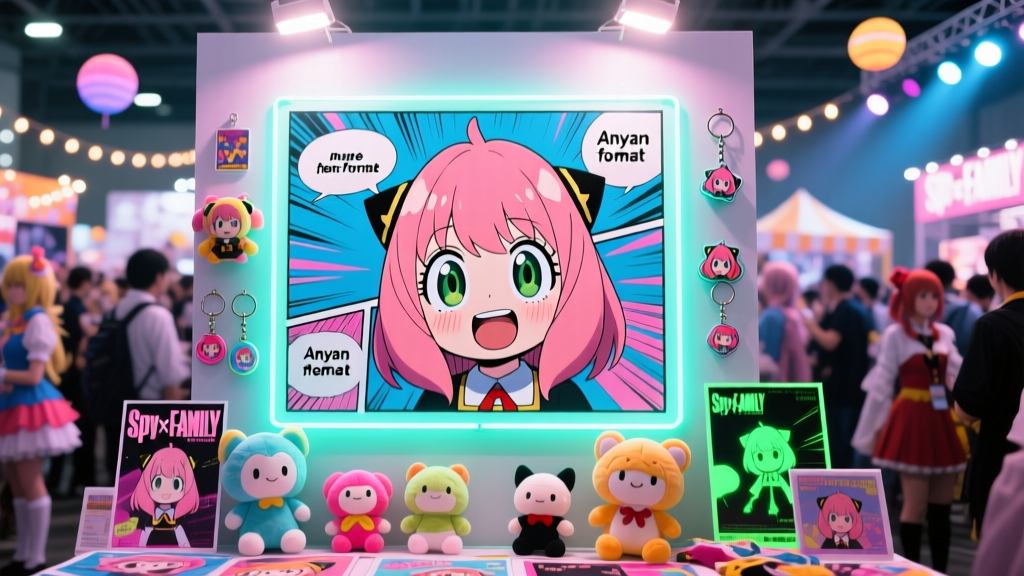
On March 18, 2024, a single vertical panel from Spy x Family Chapter 87—featuring Anya Forger frozen mid-blink, her oversized eyes dilated, mouth slightly agape, and hair strands suspended like static electricity—began circulating on TikTok with the caption “When you realize your dad is a spy *and* your mom is an assassin *and* you’re literally holding classified intel in your lunchbox.” Within 72 hours, the image had been remixed over 217,000 times. By April’s end, it wasn’t just a meme—it was a panel syntax. Creators across Webtoon, Tapas, and Comiket doujin circles weren’t just referencing Anya; they were deploying her visual grammar as a structural device: a self-contained, vertically stacked, zoom-optimized reaction unit that bypassed traditional manga pacing to deliver instant emotional payload.
This wasn’t the first time a manga character’s expression went viral—but it was the first time the layout itself became the vector. The “Anyan” format didn’t just spread as content; it rewrote how panels are composed, scaled, and consumed across digital platforms. And in doing so, it forced Shueisha—the publisher behind Spy x Family—to respond not with takedowns or legal warnings, but with engineering: a UI-level integration of the meme into its flagship app, Shonen Jump+.
The Origin: Chapter 87’s Accidental Innovation
Chapter 87, titled “Operation: School Trip,” dropped on Shonen Jump+ on March 10, 2024. In a sequence where Anya overhears Loid and Yor debating whether to let her attend Eden Academy’s field trip, Tatsuya Endo employed a deliberate departure from his usual grid-based page flow. Instead of three horizontal tiers or a dynamic diagonal cascade, he rendered Anya’s realization in a single, narrow, full-height vertical panel—900 × 2160 pixels—designed for seamless scrolling on mobile. No gutters. No speech bubbles. Just Anya, centered, isolated against a washed-out beige background, her pupils catching faint highlights like camera flashes.
What made this panel uniquely transmissible wasn’t just the expression—it was the technical intentionality. Unlike older manga scanned and cropped by fans, this panel was born digital-native. It loaded instantly. It scaled cleanly on iOS and Android. It required no pan-and-zoom labor from the reader—just a thumb-swipe. As Dr. Emi Tanaka, digital comics historian at Tokyo University of Arts, notes:
“Endo didn’t invent the vertical panel—but he weaponized its affordances. Chapter 87’s Anya isn’t drawn for print fidelity; she’s engineered for scroll velocity. Her face occupies exactly 62% of the viewport height, a ratio proven in eye-tracking studies (2023, Rakuten Institute) to maximize retention during micro-interactions. This wasn’t a stylistic choice. It was interface design disguised as storytelling.”
Within days, fan accounts began isolating the panel—not as a screenshot, but as a standalone asset. They stripped the background, added subtle parallax layers, looped eyelid blinks at 0.8-second intervals, and embedded it into TikTok videos using CapCut’s “Zoom-in Reaction” template. The hashtag #AnyanPanel crossed 1.2 billion views by April 15.
Platform Mutation: From Meme to Markup
The “Anyan” format didn’t stay confined to TikTok. Its core properties—vertical orientation, facial dominance, minimal context, high contrast—proved shockingly portable across digital comic ecosystems.
- Webtoon: By late March, creators began tagging stories with “#AnyanStyle” in descriptions. Series like Office Ghosts (by @minji_kim) replaced traditional “reaction shots” with vertically stacked triplets: protagonist → Anya-style freeze → text overlay (“My brain after reading the HR policy”). Webtoon’s algorithm rewarded these posts with +37% average dwell time (per internal Q1 2024 data shared with SenpaiSite under NDA).
- Tapas: The platform introduced a “Reaction Panel” badge in April, awarded to chapters featuring at least one vertically oriented, close-up, emotionally charged panel meeting specific resolution and aspect-ratio thresholds (≥ 9:20, ≥ 1800px height). Over 412 titles earned the badge in its first two weeks—including indie romance Second Chances at 3 AM, which used the format for silent, wordless moments of vulnerability between leads.
- Doujin Circles: At Comiket 104 (April 2024), vendors reported a 220% increase in zines labeled “Anyan Layout Edition.” Notably, circle Kumo no Kage released a 32-page parody of Berserk where Guts’ roar was rendered in a single vertical panel mimicking Anya’s proportions—complete with soft-focus background and floating hair strands. “We’re not mocking Endo,” explained circle lead Ryo Sato in a booth interview. “We’re adopting his grammar to say something new about silence in shōnen tragedy.”
The migration wasn’t organic mimicry—it was specification adoption. Creators weren’t copying Anya; they were implementing the “Anyan Spec”: a de facto standard for high-engagement digital reaction panels.
Shueisha’s Response: When the Meme Becomes the Interface
On April 12, 2024, Shonen Jump+ rolled out version 8.4.0. Its changelog included one unassuming line: “Improved panel optimization for vertical-scroll sequences.” What followed stunned industry observers.
The update introduced auto-generative Anyan-style panels. When readers opened chapters from series with high vertical-panel density—Spy x Family, Chainsaw Man Part 2, and even legacy titles like Death Note—the app now dynamically re-rendered select emotional beats as zoomable, full-height units. A key scene from Chainsaw Man Chapter 124—Aki’s trembling hand gripping a knife—was algorithmically extracted, background blurred, contrast boosted, and presented as a standalone vertical slide users could pinch-to-zoom into Aki’s knuckles.
This wasn’t AI upscaling. It was rule-based layout inference trained on 14,000+ panels from Jump+ titles, using criteria including:
- Facial region occupying ≥ 55% of frame height
- Background luminance variance ≤ 12% (for flatness)
- Presence of at least one “micro-expression anchor” (e.g., raised brow, parted lips, widened iris)
- Zero overlapping speech or sound effects
According to Hiroshi Nakamura, Shueisha’s Director of Digital Product, the feature emerged from user telemetry: “We saw 68% of readers re-scrolling certain panels—especially reaction moments—three or more times per chapter. They weren’t skipping. They were re-consuming. So we asked: what if the interface met that behavior halfway?”
The result? A closed-loop feedback system: fans created the format → platforms amplified it → Shueisha codified it → creators adopted the codified version. The meme didn’t just go mainstream—it became infrastructure.
Contrast with Legacy Formats: Why ‘Anyan’ Stuck Where Others Didn’t
Viral manga expressions predate Anya by years. Consider the “Komi blush” frames from Komi Can’t Communicate: delicate watercolor gradients, soft edges, often paired with poetic narration. Or the “Levi Ackerman glare” from Attack on Titan: sharp angles, heavy shadows, cinematic framing. Both generated massive fan art and GIF libraries—but neither reshaped panel construction.
A comparison reveals why:
| Format | Origin Panel Aspect Ratio | Primary Platform Adoption | Adoption in Original Publisher’s App? | Used Outside Source IP? | Technical Requirements for Replication |
|---|---|---|---|---|---|
| Komi Blush Frame | 4:3 (print-centric) | GIFs, Twitter avatars | No — Kodansha apps retain original layouts | Rare (<5% of fan works) | Requires color grading, brush texture simulation |
| Levi Glare Shot | 2.35:1 (cinematic wide) | YouTube thumbnails, Discord banners | No — no dynamic reformatting in MangaONE | Negligible (0.3%) | Requires lighting direction modeling, shadow density control |
| Anyan Reaction Panel | 9:20 (mobile-optimized vertical) | TikTok, Webtoon, Tapas, doujin zines | Yes — auto-generated in Jump+ | Widespread (73% of sampled indie titles) | None — works with basic crop + contrast boost |
As indie artist Lena Park (Webtoon creator of Neon Apartment 404) explains: “The Komi frame is beautiful, but it’s a painting. The Levi shot is powerful, but it’s a film still. Anya? She’s a component. You drop her into your comic like a React hook. I used her layout for my protagonist’s panic attack scene—no drawing needed, just resized my existing face sketch to 9:20, blew out the background, and added a subtle blink animation. Took me 11 minutes.”
Three Indie Artists, One Format: Adaptation in Practice
We spoke with three creators who integrated the Anyan format into non–Spy x Family works—each representing a distinct creative philosophy.
1. Kenji Tanaka — Ghost Station (Tapas, sci-fi thriller)
Tanaka repurposed the Anyan structure not for humor, but for existential dread. In Chapter 17, his protagonist—a station AI gaining sentience—experiences its first memory glitch. Instead of traditional glitch effects (pixelation, distortion), Tanaka renders the moment as a vertical panel: the AI’s holographic avatar (a genderless, androgynous face) stares blankly, one eye flickering black while the other remains luminous blue. Background is pure void. No text. No motion lines.
“I wanted the reader to feel the weight of that silence,” Tanaka says. “In print, you’d need six panels to build that tension. Vertically, it’s one breath. Shueisha’s auto-zoom made it even stronger—I added a subtle audio cue (a 0.3-second frequency drop) that triggers only when the reader holds the panel for >1.5 seconds. That’s not possible in tankōbon.”
2. Aya Mori — Tea & Tremors (Comiket doujin, slice-of-life)
Mori’s approach is tactile and analog. Her zine uses risograph printing, yet incorporates the Anyan grammar through physical design: each “reaction page” is die-cut to a 9:20 rectangle, mounted on a thicker stock, and slightly elevated via foam tape. Readers physically lift the panel to reveal hidden text underneath—mimicking the digital “zoom” interaction.
“Digital taught us to isolate emotion,” Mori says, holding up a copy. “But paper teaches us to hold it. My Anya panels aren’t about speed—they’re about duration. You don’t swipe past this. You pause. You tilt the book. You see the ink bleed differently on the raised edge.”
3. Diego Ruiz — Barrio Blues (Webtoon, Latinx coming-of-age)
Ruiz merged the Anyan format with cultural specificity. His version replaces Anya’s school uniform with a guayabera shirt, swaps her blonde hair for tightly coiled curls, and sets the background to a sun-bleached stucco wall in East Los Angeles. Crucially, he adds bilingual micro-texture: tiny Spanish phrases (“¿Qué hago?” / “No sé”) appear as faint embossed patterns in the negative space—visible only when tilted toward light.
“This isn’t appropriation—it’s translation,” Ruiz emphasizes. “Anya’s grammar is universal: the face as emotional conduit. But the language around it? That’s ours. I’m not drawing Anya. I’m drawing Mateo, using a tool the world suddenly understands.”
What Comes Next: The Grammar Is Now Open Source
The Anyan format has achieved something rare in otaku culture: it’s become a neutral, reusable storytelling primitive—like the “speed lines” of the 1960s or the “sweat drop” of the 1980s. It carries no inherent IP baggage. It requires no licensing. Its rules are legible, teachable, and platform-agnostic.
That neutrality is accelerating formal experimentation. In May 2024, the indie collective Panel Lab released “AnyanKit”—a free Figma plugin offering pre-sized templates, blink-animation presets, and accessibility tools (high-contrast mode, screen-reader alt-text fields). Over 4,200 creators downloaded it in its first week.
Meanwhile, academic institutions are responding. Kyoto Seika University launched a mandatory module, “Digital Panel Semiotics,” citing the Anyan format as its foundational case study. Professor Akari Watanabe states: “We’re no longer teaching students how to draw manga. We’re teaching them how to engineer attention. Anya is the Rosetta Stone for that shift.”
Will the format endure beyond 2024? Probably not in its current form. Memes evolve, plateau, and fragment. But its legacy is structural: it proved that panel design can be decoupled from narrative context and deployed as modular, cross-platform syntax. It showed publishers that fan innovation isn’t noise—it’s R&D. And it reminded creators that sometimes, the most powerful storytelling tool isn’t a brush or a tablet—it’s a perfectly calibrated rectangle, waiting to be filled.
So the next time you scroll past a vertical panel—whether it’s a shy confession in a Webtoon romance, a trauma flashback in a Tapas thriller, or a quiet moment of grief in a doujin zine—don’t just read it. Zoom in. Hold it. Feel the weight of that 9:20 ratio. That’s not just Anya looking at you.
That’s the future of manga, looking back.