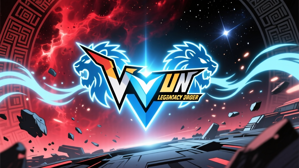
You see it on a black t-shirt at a convention and you know exactly what it means. Two angular wings flanking a central blade, all rendered in that unmistakable gold-on-dark contrast that screams "I watched this show at 2 AM and it wrecked me." The Voltron: Legendary Defender logo isn't just a title card slapped onto merchandise — it's a piece of graphic design that carries seven seasons of intergalactic warfare, found family, and a robot made of lions. And somehow, it manages to do all of that without looking like a corporate afterthought.
What's interesting about this particular emblem is how it threads the needle between nostalgia and reinvention. The original 1984 Voltron: Defender of the Universe had its own branding — blocky serif lettering, a snarling lion head, the kind of maximalist energy you'd expect from an era when every cartoon logo looked like it was painted on the side of a van. The Legendary Defender emblem had a completely different job to do. It needed to honor that legacy while signaling to a 2016 audience that this wasn't your parents' Voltron. And it pulled that off through restraint, not excess.
From Defender of the Universe to Legendary Defender: A Visual Genealogy
To understand why the Legendary Defender logo works, you have to know what it was reacting against. The 1984 Voltron logo was pure Saturday-morning-cartoon energy: thick, rounded lettering with a chrome or metallic gradient, usually accompanied by a lion's face mid-roar. The color palette leaned heavily on warm golds and saturated reds. It was loud, unapologetic, and designed to grab a kid's attention between cereal commercials. The font had weight — you could almost feel the plastic of a toy package when you looked at it.
When DreamWorks Animation and World Events Productions announced the reboot in January 2016, the design challenge was obvious. The franchise needed a visual identity that could sit next to contemporary animated properties — Avatar: The Legend of Korra, Steven Universe, Gravity Falls — without looking dated. Studio Mir, the South Korean animation house that handled production (the same studio behind Korra's kinetic action sequences), brought a cleaner, more angular aesthetic to everything in the show, including its branding.
The Legendary Defender logo that emerged had three defining characteristics:
- Angular wing motifs — Two stylized wings or blade shapes fan outward from the center, echoing the lion-formation sequence where five mechs lock into the Voltron silhouette.
- Geometric sans-serif typography — The "VOLTRON" wordmark uses clean, sharp-edged letterforms with tight kerning. No serifs, no chrome gradients. Just precision.
- Subtitle hierarchy — "LEGENDARY DEFENDER" sits below in a smaller, lighter weight, creating a two-tier system that works at both billboard scale and app-icon scale.
The result was something that looked equally at home on a Netflix thumbnail and a Funko Pop! box. That's not an accident — it's deliberate brand architecture designed for a multi-platform, multi-merchandise ecosystem.
Deconstructing the Emblem: A Graphic Design Breakdown
Let's get into the weeds on this thing, because the design choices are more considered than most people give them credit for.
The central emblem — the one fans tattoo on their arms and stick on their laptops — is essentially a stylized V-shape with wing extensions. The silhouette reads as both the letter "V" (for Voltron, obviously) and as a simplified version of Voltron's own head profile when you tilt your head slightly. That dual-read is the kind of thing graphic designers lose sleep over. When you can make a mark that says two things with one shape, you've done your job.
Color-wise, the emblem relies on a restricted palette that maps directly to the show's visual language:
| Color Role | Hex Value (Approx.) | Usage Context | Lion Mapping |
|---|---|---|---|
| Lion Gold | #D4A843 |
Primary emblem, title text | Black Lion (accent trim) |
| Space Blue | #1A3A5C |
Backgrounds, secondary fills | Blue Lion |
| Energy Green | #3FB950 |
Glow effects, energy accents | Green Lion |
| Crimson Red | #C23B22 |
Variant emblem editions | Red Lion |
| Royal Yellow | #E3B341 |
Accent details, highlights | Yellow Lion |
| Void Black | #0D1117 |
Primary background | Black Lion (body) |
The lion-to-color mapping isn't arbitrary. In the show, each lion is coded to its pilot and its elemental identity. Black Lion forms Voltron's head and torso — the core. Red and Blue become the arms. Green and Yellow lock in as the legs. The branding system mirrors this assembly: gold dominates the emblem the way Black Lion dominates the formation, with the other colors appearing as accents depending on the context. Merchandise variants will sometimes swap the gold for red or blue to spotlight a specific lion, and that flexibility is baked into the design from the start.
The Altean Crest Connection
One detail that gets overlooked: the chest plate Voltron wears in the show bears the Altean royal crest — the coat of arms of Princess Allura's family. This isn't the same as the show's title logo, but it shares the same angular, wing-like geometry. The design team clearly built a visual language where the macro (the show's branding) and the micro (in-universe heraldry) speak the same dialect. When you see that crest on Voltron's chest during a battle sequence, it's reinforcing the same themes the title card establishes before the episode even starts: legacy, royalty, a mantle passed down.
How the Logo Evolved Across Seasons
The show ran for eight seasons (technically seven production seasons plus a final "season" that wrapped the story in December 2018), and the branding shifted subtly as the narrative escalated.
Seasons 1-2 (2016): The logo debuted in its standard form — gold emblem on dark backgrounds, the wordmark locked up with "LEGENDARY DEFENDER" underneath. Title cards at the start of each episode used the emblem as a static stamp, no animation beyond a brief glow. The Netflix thumbnail art for these early seasons used the emblem at large scale against starfields, which helped it become instantly recognizable even at small mobile sizes.
Seasons 3-5 (2017-2018): As the Galra Empire conflict intensified in the plot, promotional materials began using variant treatments. The emblem appeared in Galra purple on occasion — a deliberate choice to signal Lotor's arc and the corruption of Voltron's legacy. Fan communities on Reddit and Tumblr immediately started cataloguing these color shifts, treating each variant like a spoiler coded in Pantone.
Seasons 6-8 (2018): The final arc brought the logo back to its gold-standard form, but promotional art for the series finale used a cracked or fragmented version of the emblem. The wings were slightly separated, the central blade showed fracture lines. It was a visual gut-punch that told you, without a single word, that the team was being tested to its breaking point. That kind of environmental storytelling through branding is rare in animated television.
"The best logos don't just identify — they narrate. The Legendary Defender emblem tells you the show's thesis before you press play: five broken pieces becoming one unbreakable whole."
The Classic vs. Legendary Defender Logo: A Side-by-Side Smackdown
If you put the two logos next to each other, the generational gap is immediate. Here's what separates them at a structural level:
| Attribute | Classic Voltron (1984) | Legendary Defender (2016) |
|---|---|---|
| Typeface style | Heavy serif, chrome gradient | Geometric sans-serif, flat color |
| Lion imagery | Illustrated lion head (snarling) | Abstracted wing/V-shape (no literal lion) |
| Color approach | Warm metallics (gold, bronze, red) | Cool contrast (gold on dark, blue accents) |
| Scalability | Poor — loses detail at small sizes | High — reads clean at 16px favicon to billboard |
| Target audience | Children (toy marketing primary) | All-ages (streaming platform primary) |
| Merchandise flexibility | Locked treatment | Modular — lion color variants, faction emblems |
| Design era influence | 1980s toy packaging, He-Man, Transformers | Flat design, Material Design, minimalist branding |
The biggest philosophical difference? The classic logo showed you a lion. The Legendary Defender logo implies one. That shift from explicit illustration to abstract suggestion is the single biggest marker of how branding evolved between 1984 and 2016. Modern audiences don't need the lion drawn for them — they know the shape language. A sharp V with wings is enough to trigger the association, especially when it's been reinforced through 78 episodes of content.
Fan Culture: The Logo in PNG, Fan Art, and Digital Expression
Search for "Voltron Legendary Defender logo PNG" and you'll hit a wall of results across CleanPNG, PNGEgg, HiClipart, IMGBIN, and KindPNG — at least 220 distinct transparent-background versions catalogued across these platforms as of mid-2025. That volume tells you something about the demand. Fans aren't just looking at this logo; they're extracting it, remixing it, and building things with it.
Here's what the fan ecosystem actually does with these PNG assets:
Profile Pictures and Banners
The emblem crops up constantly as Discord server icons, Twitter/X profile headers, and Twitch overlay elements. Because the logo reads cleanly at small sizes (that geometric construction pays off), it works as a 128x128 avatar without turning into a muddy blob. Fans often swap the gold for their favorite lion's color — a Blue Lion variant for Lance stans, green for Pidge defenders. It's a quiet tribal signal, the same way sports fans wear their team's colors.
Fan Art Compositions
On DeviantArt and Tumblr, the logo frequently appears as a compositional anchor in fan illustrations — placed behind character group shots, integrated into cosmic backgrounds, or stamped onto in-universe documents like Garrison badges or Paladin ID cards. The DeviantArt tag "voltron_legendary_defender" pulls thousands of results, and a meaningful percentage incorporate the emblem as a design element rather than a standalone subject. That's a sign of a logo that functions as a visual building block, not just a label.
Cosplay and Physical Props
Cosplayers building Paladin armor or Garrison uniforms routinely use the logo as a chest or shoulder decal. The clean vector lines make it ideal for vinyl cutting and heat transfer. Walk through Artist Alley at any mid-size anime convention and you'll find the emblem on enamel pins, sticker sheets, and iron-on patches — most fan-made, many using PNG-sourced artwork as the base template.
Video Edits and AMVs
The logo shows up in fan-made AMVs (Anime Music Videos) and edit compilations on YouTube and TikTok, typically as an intro or outro stamp. The angular wings animate well — fans add glow effects, particle bursts, or formation sequences where the five lion colors light up the emblem one by one. Some of these edits rival the show's own title sequences in production quality.
Merchandise Where the Logo Does the Heavy Lifting
The Voltron: Legendary Defender merchandise pipeline was active from roughly 2017 through 2020, with licensed products spanning multiple categories. In every case, the logo was the primary visual anchor — the thing that transformed a generic product into a Voltron product.
Apparel: Hot Topic and BoxLunch both carried licensed Voltron t-shirts, and the logo-forward designs consistently outsold character-art designs. A black shirt with the gold emblem across the chest was a safe buy — recognizable to other fans, invisible to everyone else. That's the holy grail of fandom merch: legibility within the tribe without looking like a walking billboard to outsiders. The Voltron.com store also offered lion-head shirts by Fin Fun Wear, which used a complementary but distinct design alongside the main logo.
Collectibles: Funko released both Pop! vinyl figures and Hikari sofubi figures under the Legendary Defender branding. The Super Voltron Pop! — an SDCC exclusive in 2018 — featured the emblem on its packaging as the primary brand identifier. Gemini Collectibles produced a pewter Voltron limited to 500 pieces, where the logo appeared on the certificate of authenticity and box sleeve. In the collectibles space, the logo functioned as a seal of authenticity, the thing that separated licensed product from bootleg.
Print and Paper Goods: Poster prints, art books, and sticker sheets all used the emblem as a header or footer element. The "Art of Voltron: Legendary Defender" book (released alongside the show's final season) featured a debossed version of the logo on its cover — gold foil on matte black. It was the kind of treatment that turned a reference book into a display piece.
Convention Exclusives: At SDCC 2018, the Voltron: Legendary Defender booth held a panel and signing event where the emblem was the dominant graphic across banners, tablecloths, and giveaway bags. The brand presence at conventions relied almost entirely on the logo rather than character art — a pragmatic choice, since character art requires licensing specific character likenesses while the logo is a single, universally applicable asset.
What the Logo Says About Modern Mecha Branding
There's a broader trend at work here. If you look at how mecha franchises have rebranded over the last decade — Pacific Rim, Evangelion rebuilds, Gundam refreshes — the direction is consistently toward cleaner, more scalable emblems. The era of detailed illustration in logos is over for properties that intend to live across digital platforms. A logo that can't survive as a 32x32 favicon is a logo that will fail in 2026.
The Voltron: Legendary Defender emblem anticipated this. It was designed by people who understood that the logo would spend more time as a Netflix browse tile (roughly 200x300 pixels) than it would as a poster. Every line is thick enough to survive compression. Every color has enough contrast against dark backgrounds to register on OLED phone screens. The wing shapes are distinctive enough to work as a silhouette — the acid test for any emblem.
Compare it to the Pacific Rim wordmark, which uses a similar angular/industrial aesthetic, or the Gundam crest system, which has been flattening and simplifying since the Gundam Unicorn era. The Legendary Defender logo sits comfortably in that company. It reads as "mecha" without being derivative of any single predecessor.
Frequently Asked Questions
Who designed the Voltron: Legendary Defender logo?
The branding was developed internally at DreamWorks Animation Television in collaboration with Studio Mir's design team. Specific graphic designers aren't individually credited in public documentation, but the visual direction aligns with Studio Mir's broader house style — angular, clean, high-contrast — that they also applied to The Legend of Korra and Dota: Dragon's Blood.
Is the Legendary Defender logo the same as the Altean crest?
No. The Altean royal crest is an in-universe symbol that appears on Voltron's chest plate and on Altean architecture within the show. The title logo is a branding asset used for marketing, packaging, and title cards. They share similar angular geometry, but they serve different functions — one is diegetic (exists inside the story world) and the other is non-diegetic (exists outside it).
Where can I find transparent PNG versions of the logo?
Transparent-background PNGs are widely available on platforms like CleanPNG, PNGEgg, HiClipart, and IMGBIN. Search for "Voltron Legendary Defender logo" on any of these sites. For the highest quality, look for versions that are at least 1000px wide — these hold up for print and large-format digital use. Keep in mind that fan-uploaded PNGs may have quality loss from repeated compression.
Can I use the Voltron logo for my own merchandise or fan projects?
The Voltron: Legendary Defender logo is a trademarked and copyrighted asset owned by DreamWorks Animation Television (a division of NBCUniversal/Comcast). Using it on products you intend to sell is a trademark violation. For personal, non-commercial fan projects — wallpapers, fan art, cosplay props — usage generally falls under tolerated fan activity, but it doesn't carry any legal safe harbor. If you're planning a commercial project, contact DreamWorks Animation's licensing department directly.
Why did the logo change color in some promotional materials?
During seasons 3 through 5, promotional artwork occasionally rendered the emblem in Galra purple or shifted the gold to a muted tone. These were intentional narrative-driven choices tied to Lotor's storyline and the corruption of Voltron's legacy within the plot. The standard gold treatment returned for the final seasons as the narrative resolved.
What font does the Legendary Defender logo use?
The "VOLTRON" wordmark uses a custom geometric sans-serif typeface that appears to be either a heavily modified commercial font or a bespoke creation for the production. The letterforms feature uniform stroke widths, sharp terminals, and tight letter spacing — characteristics consistent with display faces designed for science fiction branding. No official font name has been publicly released by the production team.
The Voltron: Legendary Defender logo endures because it was built to do more than look cool on a title card. It was engineered for a franchise that needed to function across streaming thumbnails, convention banners, t-shirt prints, and fan-made stickers — all while carrying the emotional weight of a story about five pilots who learned to become one. That's a lot to ask from a few lines and a wordmark. The emblem delivers.