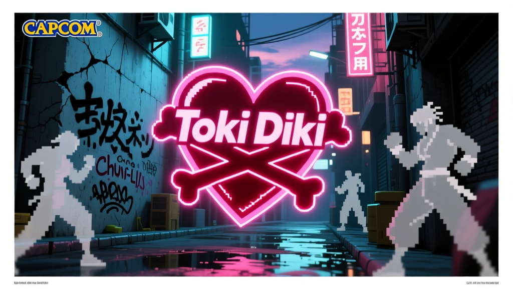
Walk through the artist alley at any major anime convention from San Diego to Singapore and you will spot it within minutes: a stylized heart sitting on top of crossed bones, usually splashed across a vinyl figure, a screen-printed tee, or a sticker slapped onto someone's laptop. That mark is the tokidoki logo — sometimes spelled out in searches as "Toki Doki" — and it belongs to one of the most recognizable independent lifestyle brands to emerge from the collision of Italian graphic design and Japanese pop culture.
The brand was founded in 2005 by Simone Legno, a Rome-born illustrator who had spent years obsessing over Japanese visual culture from across the Mediterranean, alongside co-founders Pooneh Mohajer and Ivan Arnold. The name translates to "sometimes" in Japanese — chosen, according to the company's origin story, because "everyone waits for moments that change one's destiny." That sentiment sounds poetic until you look at the trajectory: from a small web store selling printed tees to a globally distributed brand with retail locations, licensing deals with Marvel and Capcom, and limited-edition vinyl figures that resell for hundreds of dollars on the secondary market. The "sometimes" moment arrived fast and it arrived hard.
The Logo Itself: What That Heart-Crossbones Mark Actually Says
The tokidoki logo is deceptively simple. A rounded, almost cartoonish heart sits perched above a pair of crossed bones — the kind you would associate with a pirate flag, except rendered in a cute, rounded line weight that owes more to Sanrio character design than to any maritime warning system. It reads simultaneously as threatening and adorable, which is exactly the point.
Legno has spoken in interviews about his fascination with visual contrasts: taking something that looks aggressive or transgressive and softening it with kawaii design language, or vice versa. The heart-crossbones emblem encapsulates that entire philosophy in a single glyph. It is street art's rebelliousness wrapped in the bright, saturated palette of Japanese character goods. You can slap it on a skateboard deck, a luxury handbag, or a fighting game collaboration tee and it never looks out of place because the duality is baked into the design from the start.
From a pure branding standpoint, the mark hits several technical requirements that many design studios charge tens of thousands of dollars to achieve:
- Scalability — It works at 16 pixels as a favicon and at 16 feet as a convention booth backdrop.
- Monochrome viability — Strip it to black-and-white and it still reads instantly.
- Cultural neutrality — Neither the heart nor the bones are culture-specific symbols in a limiting way; they cross borders without translation.
- Emotional range — It can signal playful, edgy, ironic, or sincere depending on context and colorway.
Compare this to the Supreme box logo or Stussy's scrawled signature: all three marks succeed because they are visually primitive enough to become empty vessels into which the audience projects meaning. The tokidoki logo just happens to do it with more overt personality.
Simone Legno's Visual Vocabulary: Where Rome Meets Harajuku
Understanding the tokidoki brand requires understanding Legno's specific artistic diet. Growing up in Rome, he absorbed European comics, graffiti, and punk visual culture. But he also spent enormous amounts of time consuming Japanese media — anime, manga, character goods, the whole ecosystem. When he finally began traveling to Japan regularly in the early 2000s, those two visual worlds fused into something that did not quite exist yet in the Western market.
The resulting style pulls from several identifiable traditions:
Superflat Aesthetics
Takashi Murakami's Superflat movement — which deliberately collapses the distinction between "high" fine art and "low" commercial design — is the most obvious structural influence. Legno's work shares that flattened, graphic quality where characters exist without perspective or depth, floating on solid color fields. But where Murakami leans toward a psychedelic, almost clinical precision, Legno injects a rougher, more hand-drawn energy that reads as closer to street art.
Graffiti and Street Culture
The color choices often echo spray paint palettes: hot pinks, electric blues, acid greens, and stark blacks. Some of Legno's character designs feature drip effects, splatter textures, and stencil-like hard edges that come directly from the graffiti toolkit. His original character roster includes figures like Bastardino (a gun-toting thug with a cross on his face) and Adios (a Day of the Dead-styled skeleton) that carry an unmistakable street-attitude edge beneath their cute proportions.
Kawaii Character Design
Despite the street aggression, the core DNA of tokidoki's character lineup remains rooted in Japanese kawaii principles: oversized heads, simplified facial features, bold outlines, and a saturated color spectrum. Characters like SANDy (a star-eyed surfer girl), Mozzarella (a cheese-cat hybrid), and the various creatures populating the tokidoki universe follow the same visual logic that made Hello Kitty and Gudetama global phenomena — instant recognizability at thumbnail size.
"I have explored various artistic styles, ranging from graffiti to pop art to Japanese art, and I found that the fusion of these influences creates something that speaks to people across cultures."
— Simone Legno, on his artistic approach
The Capcom Connection: Street Fighter Gets the Tokidoki Treatment
On July 19, 2010, Capcom USA announced what they called "our most fun collaboration to date" — a partnership with tokidoki to produce limited-edition Street Fighter apparel. The initial drop consisted of just 400 shirts, sold exclusively at San Diego Comic-Con that year. The scarcity was deliberate: 400 units across multiple designs meant each variant was effectively a micro-run collectible from day one.
The collaboration worked because both brands share a visual DNA that most people do not immediately notice. Street Fighter's character design has always been bold, cartoonish, and personality-forward — Ryu's stoic white gi, Chun-Li's blue qipao and ox-horn buns, Sagat's towering Muay Thai silhouette. These are characters built to read at a glance on an arcade cabinet from six feet away. Tokidoki's design language operates on the same principle: bold outlines, saturated fills, instant character recognition.
The mashup translated Street Fighter's roster into Legno's signature style. Ryu appeared with tokidoki's characteristic star-shaped eyes and flattened proportions. Chun-Li was rendered in the brand's cute-but-tough aesthetic. Sagat, M. Bison, and other fighters received similar treatment, with each design maintaining enough of the original Capcom character model to be instantly identifiable while carrying the tokidoki visual stamp.
By November 2012, the collaboration had expanded well beyond the initial SDCC drop. A holiday tee collection hit tokidoki's retail locations on Melrose Avenue and in Santa Monica, as well as the online store. This wave featured designs incorporating both tokidoki's original characters (SANDy, Bastardino, Adios, Mozzarella, Hunter) and Street Fighter's iconic fighters (Chun-Li, Ryu, Sagat) in crossover compositions — a literal visual merger of the two universes on a single garment.
The collaboration has continued in waves over the years, with new drops timed around game releases, anniversary milestones, and convention appearances. Each wave tends to sell out quickly, driven by the intersection of two passionate collector communities: fighting game fans who treat Street Fighter merchandise as memorabilia, and designer toy enthusiasts who track tokidoki releases the way sneakerheads track Jordans.
The Collectibles and Print Market: What Actually Holds Value
Tokidoki's product ecosystem extends far beyond t-shirts. The brand's core collectible category is the vinyl figure — typically produced in runs ranging from a few hundred to a few thousand units, in sizes from 2.5 inches to 10 inches or more. These figures sit squarely in the "designer toy" market segment, a category that includes brands like BE@RBRICK, KAWS, and Dunny, where limited supply and artist reputation drive secondary market prices well above retail.
| Category | Typical Retail | Secondary Market Range | Notes |
|---|---|---|---|
| 2.5" Vinyl Figures (standard) | $12 – $18 | $15 – $45 | High-volume runs; modest appreciation |
| 10" Limited Vinyl Figures | $120 – $200 | $200 – $600+ | e.g., Black Tokimeki 10" ($200 retail); strong appreciation |
| Street Fighter x tokidoki Tees | $35 – $55 | $60 – $250+ | SDCC 2010 originals command highest premiums |
| Art Prints / Giclée | $40 – $150 | $80 – $400+ | Signed/numbered editions appreciate most |
| Convention Exclusives | Varies | 2x – 10x retail | Designer Con, SDCC exclusives; ultra-limited |
| Licensed Collab Items (Marvel, etc.) | $20 – $80 | $30 – $150 | Cross-audience demand from comic/toy collectors |
The Street Fighter collaboration pieces occupy a unique niche in this market because they sit at the intersection of three collector ecosystems simultaneously: designer toy collectors, Street Fighter memorabilia hunters, and anime/gaming culture fans. When an item appeals to three distinct buyer pools, secondary market prices tend to outperform items that only serve one audience. The 2010 SDCC exclusive tees, with their 400-unit cap, have become particularly difficult to source in deadstock condition.
On platforms like eBay, tokidoki vinyl figures from limited runs consistently appear in the designer toy and urban vinyl categories. The 2.5-inch figures — often produced as part of themed series with multiple characters and secret chase variants — encourage the kind of completionist purchasing behavior that drives both primary sales and secondary demand. A collector who already owns 11 of 12 figures in a series will pay well above retail to close the gap.
Prints, Posters, and the Art Market Crossover
Beyond three-dimensional collectibles, Legno's output as a working illustrator has generated a substantial catalog of art prints. These range from mass-produced poster prints available through the tokidoki webstore to limited-edition giclée prints, sometimes hand-signed and numbered, sold at gallery shows and convention booths.
The art prints are where Legno's dual identity as both a commercial brand operator and a fine-art-adjacent illustrator becomes most visible. Some pieces are straightforward character illustrations — a single tokidoki character rendered in full detail against a complex background. Others are more ambitious compositions that reference specific art historical traditions: ukiyo-e woodblock print layouts reimagined with tokidoki characters, or Renaissance painting structures populated by Legno's cartoon cast in place of saints and angels.
Gallery exhibitions have appeared in cities including Los Angeles, Tokyo, and Kuala Lumpur, where Legno spent time as an artist-in-residence exploring Southeast Asian visual traditions and incorporating them into new work. These shows tend to operate on a model familiar to the designer toy world: opening-night sales of limited pieces, with prices ranging from roughly $150 for open-edition prints to several hundred dollars for one-of-one canvas originals.
The print market for tokidoki art mirrors a broader trend in the pop-art and lowbrow art space, where artists who build audiences through commercial products (toys, apparel, accessories) can successfully sell fine-art-format work to the same audience. It is the same path that artists like KAWS, Shepard Fairey, and James Jarvis walked before — build the brand, grow the audience, then offer the audience original art at gallery prices.
Collaborations Beyond Capcom: The Brand's Reach
Street Fighter is the collaboration that most directly overlaps with the otaku and gaming audience, but tokidoki's licensing portfolio extends well beyond Capcom. The brand has produced official merchandise for Marvel, creating tokidoki-styled versions of Spider-Man, Iron Man, and other characters that merge comic-book iconography with Legno's cute-aggressive aesthetic.
A collaboration with Sephora brought tokidoki designs into the beauty retail space — a move that signaled the brand's ability to reach demographics far outside the convention-hall collector circuit. There have also been partnerships with footwear companies, electronics accessory makers, and food brands, each time applying the same visual treatment: take the partner's existing IP or product identity and reinterpret it through the tokidoki filter of bold outlines, saturated color, and character-forward design.
These collaborations serve a dual function. For the partner brand, they provide access to tokidoki's dedicated audience — collectors and fans who will buy anything carrying the heart-crossbones mark regardless of what it is printed on. For tokidoki, each collaboration introduces the brand to a new audience segment that may not have encountered it through the designer toy or streetwear channels.
Why the Brand Resonates with the Otaku Audience Specifically
There is a reason tokidoki has such deep penetration in anime convention culture despite not being a Japanese company and not being tied to any specific anime or manga property. The brand functions as a visual lingua franca for people who love Japanese pop culture aesthetics but exist outside Japan. Legno himself is an Italian who fell in love with Japanese visual culture from the outside and built a brand that reflects that specific experience of admiration and translation.
For the otaku audience, tokidoki occupies a space similar to what Supreme does for skate culture or what BAPE once did for hip-hop fashion: it is a brand that signals membership in a specific aesthetic tribe. Wearing a tokidoki shirt or displaying a tokidoki figure communicates that you understand the visual references, that you appreciate the kawaii-meets-street tension, and that you value limited-run goods over mass-market alternatives.
The Street Fighter collaboration amplifies this because fighting game culture and anime culture share enormous audience overlap. The same person who watches EVO tournament streams on a Friday night is very likely to attend an anime convention on Saturday afternoon. When tokidoki puts Chun-Li in their visual language, they are speaking directly to that overlap in a way that feels organic rather than corporate — which matters enormously to an audience that can smell a cash-grab licensing deal from across the convention floor.
The Logo in Context: Designer Brand Marks That Shaped a Generation
It is worth placing the tokidoki logo alongside other designer brand marks that defined the 2000s–2010s collectible and streetwear landscape. Each of these marks solved a similar problem: how do you create a visual identity that works across toys, clothing, gallery shows, and digital media without losing coherence?
- KAWS — X-ed out eyes skull: Similar cute-subversion strategy, but rooted more firmly in the fine-art gallery world. Higher price ceiling (six-figure auction results), narrower audience.
- BE@RBRICK — Medicom Toy bear silhouette: More of a product-platform mark than a traditional logo. Functions as a blank canvas for collaborations.
- Supreme — Barbara Kruger-style box logo: Text-based, relies entirely on typography and color blocking. Less character-driven than tokidoki.
- BAPE — Ape Head: Streetwear-first brand mark with similar pop-culture saturation strategy, though more rooted in hip-hop than in anime/otaku culture.
Tokidoki's heart-crossbones sits in a distinctive position within this landscape: it is the only major mark that is simultaneously character-platform (the brand has its own original character universe), collaboration-ready (adaptable to any partner's IP), and rooted in Japanese visual aesthetics while being created outside Japan. That combination is difficult to replicate and it explains why the brand has maintained relevance for two decades in a market where most designer toy labels burn out within five years.
Frequently Asked Questions
What does "tokidoki" (Toki Doki) actually mean?
The word "tokidoki" (ときどき) translates to "sometimes" in Japanese. Co-founder Simone Legno chose the name because he liked the idea that everyone has moments — sometimes unexpected — that change the direction of their life. The brand's origin story frames its own founding as one of those moments.
Is tokidoki a Japanese brand?
No. Tokidoki was created by Simone Legno, an Italian artist born and raised in Rome, along with co-founders Pooneh Mohajer and Ivan Arnold. The brand is Japanese-inspired and draws heavily from Japanese visual culture, but it is headquartered in the United States and was founded by non-Japanese creators. This outsider-looking-in relationship to Japanese aesthetics is actually central to the brand's identity and appeal.
When did tokidoki first collaborate with Capcom on Street Fighter?
The collaboration was publicly announced on July 19, 2010, by Capcom USA. The first products were limited-edition t-shirts (400 units) sold at San Diego Comic-Con 2010. The partnership has continued in multiple waves since then, with new apparel drops featuring both tokidoki's original characters and Street Fighter's roster reimagined in Legno's art style.
Are tokidoki vinyl figures a good investment?
Limited-edition tokidoki vinyl figures, particularly 10-inch runs and convention exclusives, have shown consistent secondary market appreciation. Items like the Black Tokimeki 10" figure (retail $200) have resold for significantly above original price. However, standard 2.5-inch figures from large production runs tend to hold value rather than appreciate dramatically. As with any collectible market, condition, rarity, and demand from the specific collector community matter more than the brand name alone.
Where can I buy tokidoki products?
Primary-market products are available through the official tokidoki website (tokidoki.it), select retail locations, and authorized stockists. Convention-exclusive items are only available at events like San Diego Comic-Con, Designer Con, and anime conventions where the brand has a booth presence. Secondary-market items circulate on eBay, Mercari, and designer toy trading groups.
What other brands has tokidoki collaborated with besides Capcom?
Tokidoki's collaboration portfolio includes Marvel (tokidoki-styled superhero merchandise), Sephora (beauty products with tokidoki packaging), and various footwear, accessory, and lifestyle brands. Each collaboration applies Legno's distinctive character-forward, color-saturated design language to the partner's existing products or IP.
SenpaiSite — Otaku Culture / Art & Branding — June 2026