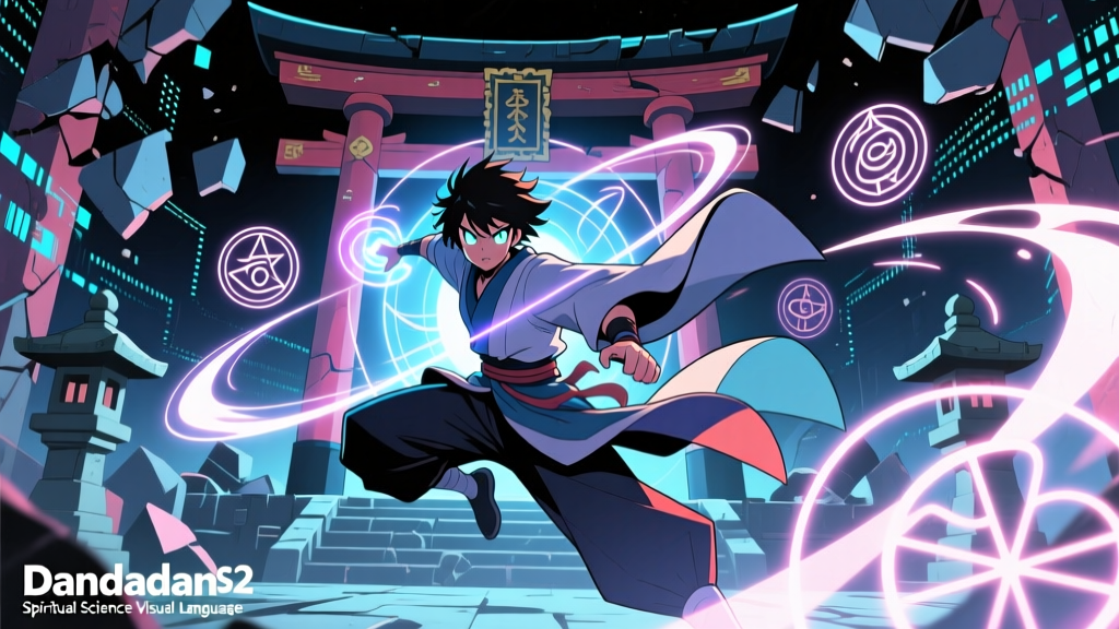
Dandadan S2: Why the ‘Spiritual Science’ Visual Language Merges 1970s Japanese Sci-Fi Posters With Onmyōdō Diagrams
When Episode 4 of Dandadan Season 2 cuts from a slow-motion punch—Momo’s fist trailing comet-light—to a sudden, full-frame zoom into a rotating Ryōkai Mandala, its lotus-center dissolving into a schematic of particle decay… that’s not just a transition. It’s a thesis statement rendered in ink and motion.
Fans didn’t just notice the shift—they argued over it. On X, a thread comparing the opening sequence’s chromatic palette to Amano’s 1975 SF Magazine cover for The Eyes of Heisenberg hit 14K reposts in under six hours. Meanwhile, on Reddit’s r/animeart, users pinned side-by-sides of cloverworks’ background art for Episode 7’s “spiritual resonance chamber” scene next to a 12th-century Kakuzenshō diagram—same concentric rings, same radial symmetry, but one annotated with quark spin values, the other with shikigami invocation mantras. The backlash wasn’t about quality. It was about legibility: Is this fusion clarifying or cloaking?
It’s clarifying—when it lands. And it lands most decisively when cloverworks treats both traditions not as decorative motifs, but as competing *systems of notation*. That distinction matters. Compare it to Ghost in the Shell: SAC’s use of cybernetic schematics: those diagrams serve exposition. They’re legible because they map to real-world engineering. But Dandadan’s hybrid glyphs don’t translate cleanly. They resist decoding—and that’s the point.
Art director Yūji Ikeda confirmed as much at AnimeJapan 2024, describing his team’s approach as “syncretic iconography”: not pastiche, not juxtaposition, but deliberate *grammatical collision*. He cited two anchors: first, the stippled, airbrushed cosmos of 1970s Japanese sci-fi—Amano, Takehiko Inoue’s early Baoh covers, the grainy, hopeful futurism of Uchū Senkan Yamato’s posters. Second, the geometric rigor of Heian-era onmyōdō diagrams—not as mystical wallpaper, but as functional cosmological maps. The Ryōkai Mandala, for instance, isn’t “symbolic” in the Western sense; it’s a ritual interface, calibrated to align human perception with cosmic order. Ikeda’s team didn’t borrow its shapes—they borrowed its *operating logic*.
That logic surfaces in Episode 6’s climactic exorcism sequence. As Okarun channels energy through a gōmon (five-element seal), the screen fractures—not into anime-standard lens flares or speed lines, but into overlapping layers: a translucent Amano-style nebula swirls behind a copper-etched taizōkai grid, while floating kanji for “electron,” “yin,” and “spin” pulse in time with the chant’s cadence. Crucially, the camera doesn’t linger on any one layer. It pushes *through* them, as if the act of exorcism itself forces reality to render in multiple ontologies at once. This isn’t visual metaphor. It’s visual epistemology.
I remember watching Episode 3’s flashback to Momo’s childhood shrine visit—the first time we see her sketching constellations beside hand-copied onmyōji talismans—and feeling a jolt of recognition. Not nostalgia, but intellectual alignment. Her notebook isn’t a child’s doodle; it’s the show’s core gesture made intimate. Cloverworks renders her dual literacy—stellar cartography and spirit taxonomy—as natural, unforced. That’s where older supernatural anime falter. Blue Exorcist treats science and faith as warring factions. Shaman King (2021) flattens both into generic “power systems.” Dandadan insists they’re parallel languages—one written in differential equations, the other in incantation and geometry—and its visuals refuse to privilege either.
But the system stumbles when clarity demands hierarchy. Episode 8’s “quantum entanglement ritual” suffers precisely because it tries to be too faithful to both sources. The animation overlays Feynman diagrams onto a rotating mandala, then adds floating vectors labeled with Sanskrit and particle physics terms. For 90 seconds, it’s exhilarating—a true syncretic high-wire act. Then it lingers. The symbols stop conversing and start competing. You stop seeing resonance and start squinting at subtitles. This falls flat because it mistakes density for depth. Ikeda’s panel stressed that syncretism requires *editing*, not accumulation—and here, the edit is missing.
What makes the fusion work elsewhere is restraint married to rhythm. Consider Episode 5’s silent sequence where Ken Takakura’s ghost appears—not as a shimmer or a wail, but as a slow, deliberate reassembly of a torn gohei (paper charm), its folds animated with the same precise, weightless physics used for orbital mechanics in Episode 1’s asteroid chase. No music. No dialogue. Just paper, gravity, and sacred geometry sharing identical kinematics. That’s the grammar clarified: same rules, different domains.
Critics noted how rarely the show explains its own iconography. There’s no infodump about why a gōmon resembles a Feynman diagram’s vertex, or why Amano’s stippling evokes both cosmic dust and kami presence. It assumes viewers will sit with the dissonance—and many haven’t. The fan discourse split along a clear line: those who’d studied Shingon esoterica or vintage SF art recognized the citations instantly; others felt alienated, calling the aesthetic “overdesigned.” I think that tension is intentional—and productive. Dandadan doesn’t want you to “get” the references. It wants you to feel the friction between frameworks, to sit in the uncomfortable, fertile silence where two ways of knowing brush against each other without merging.
That silence is where the theme lives. Science and spirituality aren’t reconciled in Dandadan. They’re held in suspension—like particles in superposition, like deities in mandalic stillness, like the breath before a chant begins. The visuals don’t resolve the paradox. They make it palpable.
And that’s why, when Episode 12 ends with Momo and Okarun standing atop a Tokyo skyscraper—not bathed in sunset light, but silhouetted against a double-exposed sky where spiral galaxies rotate inside a glowing taizōkai ring—it doesn’t feel like spectacle. It feels like syntax. Two sentences, grammatically distinct, speaking the same truth in different tongues. Cloverworks didn’t merge aesthetics. They built a bilingual dictionary—and handed us the first page.