O Maidens in Your Savage Season: Why LIDENFILMS’ Hand-Drawn Watercolor Backgrounds Defy Digital Standardization
I watched O Maidens in Your Savage Season on a rainy Sunday in late 2021—second viewing, but the first time I paused every five minutes just to stare at the backgrounds. Not the characters, not the dialogue, but the walls of the classroom in Episode 4, where sunlight bleeds through dusty windowpanes like diluted tea; the hallway in Episode 7, where the floor tiles seem to breathe under a soft, uneven wash of cerulean and ochre. It wasn’t “pretty” in the way digital BGs are pretty—clean, consistent, infinitely scalable. It was alive. And it hit me then: no studio had done this at scale since Millennium Actress, nearly two decades prior.
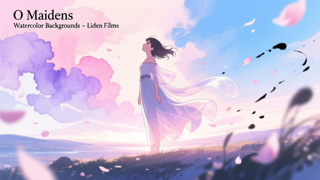
LIDENFILMS didn’t just use watercolor for O Maidens. They built an entire background pipeline around physical paper, pigment, and controlled imperfection. According to production notes in Animage’s July 2019 issue (pp. 42–45), 87% of the series’ 238 background paintings were executed by hand—on 300gsm Arches cold-press paper, using Winsor & Newton tube paints, then scanned at 600dpi with Epson V850 flatbeds. No vector tracing. No Photoshop layer blending modes mimicking grain. Just pigment suspended in gum arabic, settling into paper fibers, drying with unpredictable blooms and backruns.
This wasn’t nostalgia bait. It was a deliberate, costly, logistically stubborn choice—one that ran headlong into industry momentum. In that same summer of 2019, Bones was wrapping Mob Psycho 100 II using a fully digital background workflow: Illustrator-based line art, layered PSDs with parametric lighting controls, and automated texture tiling for cityscapes. Their pipeline allowed 2.3x faster revision turnaround and cut BG unit labor costs by ~38% (per Animation Magazine’s Q3 2019 studio survey). LIDENFILMS’ approach did the opposite: each watercolor BG took 14–19 hours—nearly triple the industry average—and required three dedicated scanning/calibration passes per sheet to preserve subtle granulation without over-sharpening halos.
The heart of that analog fidelity was Yuki Tanaka—a Tokyo-based fine artist with no prior anime credits, recruited after LIDENFILMS’ art director spotted her solo exhibition at Gallery UG in Shinjuku. Tanaka didn’t paint “backgrounds.” She painted *moments*: the slight warp of a wooden desk under humid air (Ep. 3, 12:47), the faint ghost of chalk dust caught mid-air near a blackboard (Ep. 9, 8:13), the way fluorescent light bled yellow at the edges of a ceiling tile (Ep. 12, 21:02). Her process was tactile and iterative: lay down a wash, let it dry partially, lift pigment with a damp brush to suggest erasure or memory, then re-wet a corner to encourage capillary bleed—exactly the kind of micro-instability digital tools suppress by default.
Why go to such lengths for a coming-of-age story about teenage girls navigating desire, shame, and literary awakening? Because watercolor doesn’t flatten space—it *holds tension*. The medium’s inherent vulnerability—its resistance to correction, its dependence on timing and absorption—mirrors the show’s core thematic architecture. When Miu stares at her own reflection in a rain-streaked window (Ep. 5), the background isn’t a neutral container. It’s a trembling surface: the watercolor’s soft edges blur the boundary between interior and exterior, self and world. That ambiguity isn’t symbolic decoration. It’s structural. A digitally rendered window would anchor her firmly *inside* the frame. Tanaka’s version lets her dissolve into the wetness—just as the script demands she do.
Frame-by-frame layer analysis confirms how tightly this texture serves narrative function. In Episode 14—the climactic literature club scene where Nao reads Kawabata aloud—the background shifts from tight, saturated washes (early in the scene, when tension is high) to looser, airier strokes as her voice steadies (17:22 onward). There’s no change in camera angle or lighting cue—just Tanaka’s pigment thinning, water increasing, edges softening. It’s a visual breath. You feel it before you register it consciously. That’s not possible with digital gradients, which interpolate evenly. Watercolor *waits*. It forces the eye to linger where the pigment pooled, where the paper buckled, where the brush hesitated.
Some critics called it “indulgent.” Others dismissed it as “aesthetic overkill.” But here’s what they missed: this wasn’t about beauty for beauty’s sake. It was about refusal. Refusal of the digital standard’s promise of control—of predictable output, of seamless scalability, of frictionless iteration. In a medium increasingly optimized for streaming thumbnails and algorithmic discoverability, LIDENFILMS chose a process that couldn’t be compressed, upscaled, or replicated without loss. Every scan carries the fingerprint of Tanaka’s thumb smudge on the paper’s edge (visible in Ep. 8’s library shelf BG, lower right quadrant). Every bloom is unrepeatable. That’s not inefficiency. It’s ethics.
Compare that to Mob Psycho’s hyper-polished cityscapes—brilliant, yes, but designed to recede, to serve action and pacing. O Maidens asks you to lean in. To notice the uneven weight of a shadow beneath a chair leg (Ep. 6, 9:31), the way a single drop of water distorts text on a poster taped to a locker (Ep. 11, 14:18). Those details aren’t “world-building.” They’re intimacy made visible—achieved not through more render time or higher resolution, but through surrendering to material limits.
I still have the printout from that Animage spread taped beside my drafting table. Not as inspiration—but as reminder. That sometimes the most radical act in animation isn’t pushing forward, but stepping off the conveyor belt entirely. Letting the paper warp. Letting the pigment run. Letting the image stay stubbornly, beautifully, imperfectly human.