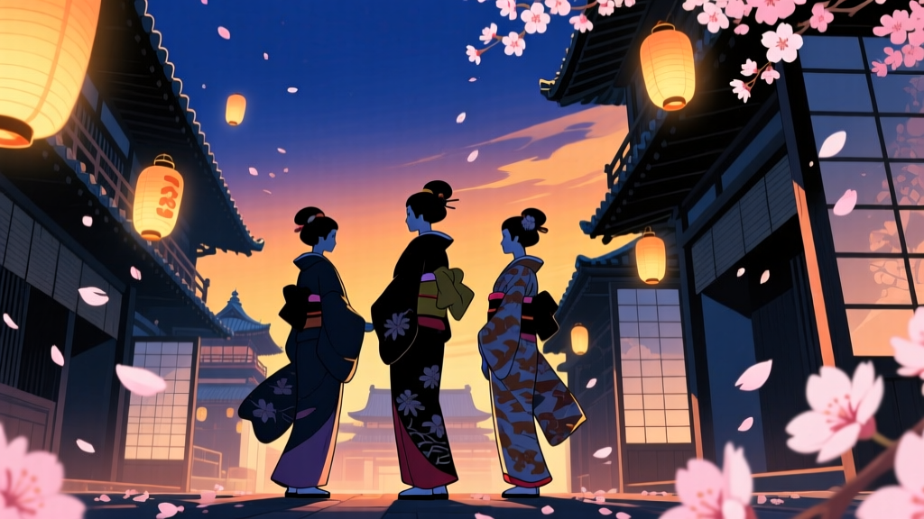
Ooku: The Inner Chambers doesn’t tell you how power works—it makes you feel its weight in the rustle of a silk sleeve and the slow fade of a corridor’s vermilion.
That first shot—Episode 1, 00:47—lingers on a single sliding door painted in shu, the deep, almost-blackened red reserved for shogunal residences. Not blood-red. Not ceremonial red. A red that has absorbed decades of candle smoke and hushed footsteps. It doesn’t open with fanfare. It slides just enough to let light spill across a tatami mat, revealing not a person, but a pair of zōri sandals—deliberately unoccupied. That silence, that empty footwear in that exact shade of red: that’s where Ooku begins its worldbuilding. Not with a title card explaining the Great Gender Reversal, not with a voiceover summarizing the Red Pox epidemic, but with color as syntax.
Studio DEEN’s 2023 adaptation is often misread as “slow” or “stiff.” I think it’s precise. Where NHK’s 2010 live-action drama leaned hard into period authenticity—hand-stitched costumes, historically accurate floor plans, actors reciting bureaucratic edicts like courtroom transcripts—it treated Edo-era power as something legible through fidelity. You could see the hierarchy: higher rank = more lacquer, longer sleeves, stricter posture. But you didn’t necessarily feel how suffocatingly *designed* that hierarchy was—not until you watched DEEN’s version, where every hue is calibrated like a diplomatic cipher.
Take the contrast between the Shogun’s private quarters (the Ooku proper) and the Edo Castle Archives. In Episode 4—the one where Yoshimune pores over the Buke Shohatto scrolls—the archive isn’t lit by warm lanterns or golden hour glow. It’s washed in indigo-blue, cool and flat, like faded ink on aged paper. The walls, the shelves, even the inkstone beside her hand—all exist within a narrow band of desaturated blues and greys. Meanwhile, just two corridors away, the inner chamber where the Shogun receives petitioners (Episode 6, the “Rice Tax Hearing”) pulses with that same oppressive vermilion, but now layered with gold leaf dusted along ceiling beams—gold so fine it catches light only when someone moves. One space records history; the other enacts it. And the color tells you, without a line of dialogue, which holds more authority—and which is meant to be forgotten.
This isn’t mood lighting. It’s gendered architecture rendered visible. In the manga, Fumi Yoshinaga sketches bureaucracy with surgical clarity: tax ledgers, succession disputes, land grants. But she also draws women’s hands—calloused from sword practice, stained with ink, trembling while signing death warrants. DEEN translates that duality into chromatic grammar. When men appear in flashbacks—pre-Pox, pre-reversal—they’re often framed in ochres and muted greens: earth tones, grounded, “natural.” Women in power? Vermilion, gold, black-lacquered lacquerware, silver-thread embroidery. Their world isn’t earthbound. It’s gilded, sealed, luminous—and utterly isolating. Watch Episode 11, the “Night Vigil” sequence: Yoshimune sits alone in the main hall after learning of her predecessor’s suicide. The camera holds on her face, lit only by a single brazier. Her skin is pale under amber light; the background dissolves into near-black. But the collar of her robe? Still that unmistakable vermilion—fading, yes, but refusing to vanish. That’s the allegory made visceral: power doesn’t disappear because it’s unjust. It stains.
Compare that to NHK’s 2010 series, where the Ooku is filmed like a museum exhibit—every kimono labeled, every ritual explained via intertitle, every political maneuver prefaced with “As per Article 7 of the Buke Code…” It’s competent. It’s respectful. And it’s emotionally inert. When Lady Arikoto dies in Episode 3 of the live-action, the scene cuts to a wide shot of the courtyard, then a medium on her grieving attendants—standard dramatic framing. In DEEN’s Episode 5, the same moment arrives without music, without close-ups: just a slow pan across her abandoned writing desk, the ink still wet on a half-finished decree, the brush resting upright in its stand—and behind it, a single vertical strip of wall painted the exact same vermilion as the Shogun’s door. The color doesn’t mourn. It endures. It judges.
Does this austerity obscure the manga’s political allegory for modern viewers? Yes—but only if you expect allegory to shout. Yoshinaga’s work has always been about quiet accumulation: how patriarchy calcifies into procedure, how resistance hides in administrative minutiae. DEEN mirrors that. When Yoshimune restructures the domain’s grain distribution in Episode 9, we don’t get a montage of smiling peasants. We get three minutes of her comparing ledger columns, her finger tracing entries, the background shifting from slate-grey (bureaucratic doubt) to soft amber (tentative resolution). The revolution isn’t in the policy—it’s in the fact that her finger, not a male regent’s, traces those numbers. The color scripting makes you sit in that duration. It forces attention on the labor of governance—not its spectacle.
I remember watching Episode 7—the “Fire Watch” episode—on a second viewing, pausing at 12:33. That’s when the fire warden (a young woman promoted from kitchen staff) walks the outer perimeter at night, her lantern casting long shadows across stone walls painted in that institutional grey-green used only for service corridors. She’s not in vermilion. Not in indigo. She’s in the in-between palette—muted olive, charcoal, ash-white. And for the first time, the camera lingers on her boots scuffing the path, not on her face. That’s where the allegory lands: not in grand speeches about equality, but in the visual permission to occupy space without symbolic ornamentation. Her movement matters because the color says it does.
Some critics called the palette “monotonous.” Others said it “lacked warmth.” But warmth isn’t neutral. In Edo-period Japan, warmth was controlled—reserved for hearths, for tea ceremonies, for sanctioned intimacy. DEEN denies it deliberately. There are no cozy domestic scenes in Ooku. No sun-dappled gardens. Even cherry blossoms appear in Episode 12—not pink, but bleached white against a steel-grey sky, petals falling onto a scroll bearing the shogunate’s seal. The austerity isn’t a limitation. It’s the point.
That said, the approach risks alienating viewers conditioned to read exposition as care. If you need to know *why* the Red Pox killed more men than women before you’ll invest in a character’s grief, DEEN won’t hold your hand. The anime assumes you’ll notice how the servants’ uniforms shift from navy to black after the Shogun’s death—not because it’s explained, but because the color signals mourning protocol. It trusts you to infer that black isn’t just sorrow; it’s demotion, surveillance, recalibration of loyalty. That trust is rare. And fragile.
Ultimately, Ooku: The Inner Chambers S1 succeeds not because it “adapts faithfully,” but because it translates Yoshinaga’s textual precision into chromatic logic. Where the manga uses footnotes and appendices to map Tokugawa bureaucracy, the anime uses hue shifts, saturation drops, and deliberate negative space. It doesn’t ask you to understand the Buke Shohatto. It asks you to feel its weight in the way light refuses to settle on a vermilion wall—or how indigo swallows sound in an archive where truth is archived, not spoken.
The revolution isn’t loud. It’s the slow, irreversible fade of one color into another—and the quiet certainty that, once changed, the palette never returns to what it was.