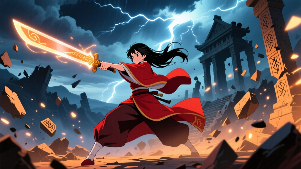
“The stones don’t lie—but the paint does.”
That’s not a quote from any official source. I made it up—while staring, slack-jawed, at the Temple of Sekhmet in Sacrificial Princess and the King of Beasts Season 2, Episode 9. And yet, it felt true. Because for the first time since this show’s gentle, sun-baked debut, the world didn’t *breathe*. It sat there—smooth, weightless, and weirdly hollow.
Season 1 was a quiet miracle: hand-painted backgrounds by Satelight’s background unit (led by Yuki Tanaka, who’d previously textured every crumbling brick in Shouwa Genroku Rakugo Shinjuu). Those backdrops weren’t just pretty—they were archaeological. You could trace the grain of sun-baked mudbrick, count the chisel marks on limestone column bases, feel the grit of wind-scoured sandstone in the way pigment pooled in recesses and lifted at edges. The pseudo-Egyptian/Akkadian setting wasn’t “inspired by”—it was *built*, layer by layer, with pigment and patience.
Then J.C. Staff took over animation production for Season 2—and swapped hand-painted textures for digital matte painting.
What changed? Not the palette. Not the composition. The *material memory*.
In S1, the palace corridors (Ep 7) had depth you could lean into: warm ochre washes layered over dry-brushed sienna underpainting, subtle cracking where plaster met stone. In S2 Ep 4—the coronation sequence—you’re looking at the same architectural motifs: papyriform columns, winged sun disks, lotus friezes. But the columns are flat. The sun disk gleams like a sticker pasted onto a gradient. There’s no sense of how light *interacts* with carved relief—it just bounces off a uniform surface. The hieroglyphs aren’t incised; they’re rendered as crisp vector outlines atop a smooth beige plane. They look legible—but not *lived-in*.
I remember watching that scene and pausing—not because it was beautiful, but because something felt *off*. Like walking into a museum diorama where the plaster has been sanded too smooth. You lose the evidence of human making. And in a world where architecture is theology—where the king’s throne room echoes temple proportions, where every doorway aligns with solstices—the loss isn’t cosmetic. It’s semantic.
Episode 9: When the Temple of Sekhmet forgets its own history
This is where it stings most. In S1 Ep 12, the Temple of Sekhmet was introduced via long, slow pans across weathered sandstone walls. Tanaka’s team used actual scanned textures from Egyptian site photos—grain, salt efflorescence, lichen stains—then hand-graded them to match the show’s soft-light logic. You saw centuries of ritual wear: smoothed thresholds, worn-down cartouches, shadowed niches where statues once stood.
In S2 Ep 9, the same temple appears—but now rendered in J.C. Staff’s new pipeline. The walls are seamless. Uniform. Clean. Even the sacred ibis reliefs are rendered with identical highlight intensity across every feather. No variation in patina. No sign of candle smoke darkening the upper registers. No dust motes catching afternoon light near the lintel. Just… clarity. And clarity, in historical worldbuilding, is often a kind of erasure.
It’s not that digital matte painting is “bad.” It’s that J.C. Staff applied it like a filter—not a language. Their artists clearly studied the reference sheets. They replicated proportions, iconography, even color theory (ochre, lapis, malachite—all present). But they missed the grammar of decay: the way lime plaster yellows differently where it meets damp stone, how copper-green verdigris pools in recesses but fades on exposed surfaces, how heat warps perspective in long colonnades until columns seem to lean inward, like worshippers bowing.
Yuki Tanaka knew this. And she said so.
In a 2023 interview with Anime Art Quarterly, Tanaka—now freelance after leaving Satelight—spoke candidly about texture as narrative infrastructure:
“In historical fantasy, the background isn’t scenery. It’s the third character. If your palace looks untouched by time, then your king hasn’t ruled for thirty years—he’s just moved in yesterday. Every scratch tells a story about who walked here, what they carried, how long they stayed. Digital tools can mimic texture, but only if the artist asks: What broke this? What polished it? What forgot it?”
That question isn’t being asked in S2. Not consistently. Not viscerally.
Contrast: Vinland Saga Season 2, Babylon Arc — texture as testimony
Wit Studio’s Vinland Saga S2 Babylon arc (Ep 20–25) is the counterpoint we need—not because it’s “better,” but because it proves digital tools *can* serve historical weight when wielded with Tanaka-level intentionality.
Look at the ziggurat courtyard in Ep 22: baked clay bricks rendered with micro-variations in firing temperature—some orange-red, some near-black where kiln flames licked them longest. Or the reed matting in the scribe’s chamber (Ep 23): individual fibers drawn with slight taper, fraying at one end, flattened where feet have passed for decades. Wit didn’t avoid digital tools—they built custom brushes that simulate trowel marks in wet plaster, or the uneven absorption of ink into papyrus pulp.
The difference isn’t budget. It’s priority. Vinland Saga treated Babylon as a civilization with material biography. Sacrificial Princess S2 treats its world as a stage set—elegant, consistent, and emotionally frictionless.
Why does this matter to fans who care about art direction as worldbuilding?
Because Sacrificial Princess isn’t just romance in a fancy costume drama. Its entire thematic spine rests on cultural translation: Sariphi, a modern Japanese girl, learning to read meaning in gesture, silence, and *space*. The way courtiers stand relative to pillars. How light falls on the king’s face during judgment—low and raking, like in Old Kingdom tomb reliefs. How the sacrificial altar isn’t just a prop; it’s a scaled-down replica of the royal mortuary temple’s offering hall.
When those spaces lose textural specificity, Sariphi’s learning process flattens too. Her awe at the scale of the granaries (S2 Ep 14) should carry the weight of millennia of grain storage tech—ventilation shafts, raised floors, clay seal impressions. Instead, the granary looks like a clean CGI warehouse with hieroglyph decals. Her realization isn’t “This system sustained empires”—it’s “This is big and old and gold.”
And that shift—from embodied knowledge to decorative antiquity—is where worldbuilding fails.
A final note on intention vs. outcome
I don’t doubt J.C. Staff tried. Their character animation in S2 is more fluid than S1’s—especially in action beats (the lion-guard sparring in Ep 6, the desert chase in Ep 11). Their lighting is richer, their color timing more cinematic. But intention doesn’t override consequence. You can’t prioritize polish over presence and expect the world to feel inhabited.
The saddest moment for me wasn’t in Ep 9’s temple—or even Ep 14’s sterile granary. It was in Ep 2, during a quiet shot of Sariphi tracing her finger along a wall carving. In S1, that same gesture would’ve revealed tiny ridges of raised relief under her fingertip, catching light like real stone. In S2, her finger glides over something that looks like a high-res photo—sharp, yes, but untouchable. A museum placard instead of a threshold.
That’s the cost of the switch: not prettiness lost, but intimacy. Not beauty abandoned, but belief eroded.
Sacrificial Princess Season 1 built a world you wanted to walk into barefoot and feel the warmth of ancient sun on your soles. Season 2 builds one you admire from behind glass.
And glass, no matter how clear, is still a barrier.